
For a recent project, we felt it was necessary to ship a few of our own custom icons. Before bringing them over to code, I tidied up the design files. It quickly dawned on me that you should follow a clear protocol to help the development be as efficient as possible. To make your and the life of your developers easier, I want to share the following 3 steps with you. Everybody loves doing less busy work! This write-up focuses on Figma because that's what we use, but most of the steps should be similar for other design software.
Step 1: Use a single icon component
Self-care is important, so this first one is for my designer buddies: Do yourself a favour and use Figma components. Most likely, the icon component will at some point be consumed by other components. A button component is a natural example of this: You often want different little icons next to your button labels. Basically, there is two ways you can go about this to make switching icons as painless as possible.
The first way is to create a component for each individual icon and give them consistent names. Then, once the icon component is consumed by other components, you can use Figma's "swap instance" feature to change icons. The advantage here is that Figma offers a search box so you can search across your components.
The other way is to put all your icons in one component, each being a variant of the component. Need a new icon? Add a variant, update, and it's available in the button. Both ways work well. In our experience, the first way might lead people towards creating inconsistently sized icons because you feel like starting from nothing with each icon. We will talk about why this inconsistency is bad in a second.
By the way, this is not exclusive to custom icons. It also helps to do this when dealing with library icons from Figma plugins (which, really, should give you a component to work with, but most of them won't).
Step 2: Size icons so they have the same aspect ratio
Now that we have the Figma in order for ourselves, we move on to help our devs. To get our custom icons from Figma to code, it is very important that they all can be exported with the same aspect ratio. You don't feel the pain of this in a design tool, but icons must be treated completely interchangeable in UI code. If different icons have different aspect ratios, that means we potentially have to adapt the whitespace of the button, table, or alert in which we use the icon to keep padding consistent. That means we must review every individual usage. Different sizes generate a lot of individual exceptions in UI code, creating undue extra work for developers. That’s why we say that this is bad architecture: Icons should not influence their parent components, they should be generic. This should be fixed at the source, so it's on us designers. To prevent fiddling with Figma's resizing options, create an explicitly sized frame in Figma and drag your icon into it.
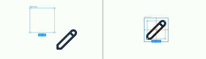
We usually don't encounter this problem because most libraries just export icons as squares. This is certainly the most one-size-fits-all approach, but if all your brand’s icons work better in a 4:3 aspect ratio, then go for it. The important thing is that every icon has the same format.
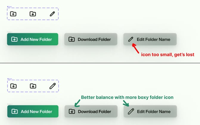
Step 3: Make sure your icons have similar visual weight
While sizing icons for export, there’s a good chance you will run into an issue where multiple icons in a button bar or a longer form are not balanced right. You correctly put all icons in same-size, same-aspect-ratio containers, but something looks off. Some icons draw the eye more. This is another thing we have to fix that libraries usually provide for us out of the box. Icons that have heavier lines, more filled out areas, or a better fitting shape for our chosen aspect ratio look bigger than others. You can make them smaller or larger within their frame to visually balance them with the other icons in your set.
It's possible you don't realise this was an issue because you can just resize icons in Figma to deal with it. But that doesn't work in code, where the size of parent components might be affected. Again, you must fix the root of the problem by not generating exceptions in the first place. Remember, developers could be dealing with hundreds of permutations here, especially if icons can be set in your site's CMS.
There you go! With the help of Figma's excellent SVG exporting capabilities, developers should be able to take it from here. These are the steps I would recommend taking with custom icons to make your own and other people's lives easier. Please try them, I'd love to know how they work for you!
Featured Image by Balázs Kétyi on Unsplash
Edit: An earlier version of this post mischaracterized how well you can swap out components in Figma now, thanks to Joshyba on Twitter for pointing this out.