


The initial situation summarised in three points
-
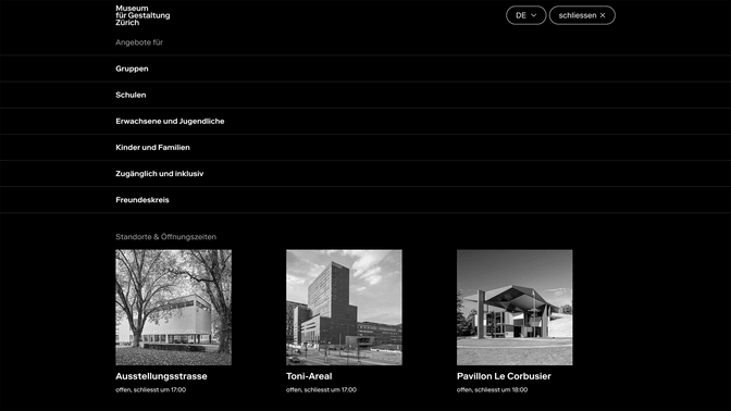
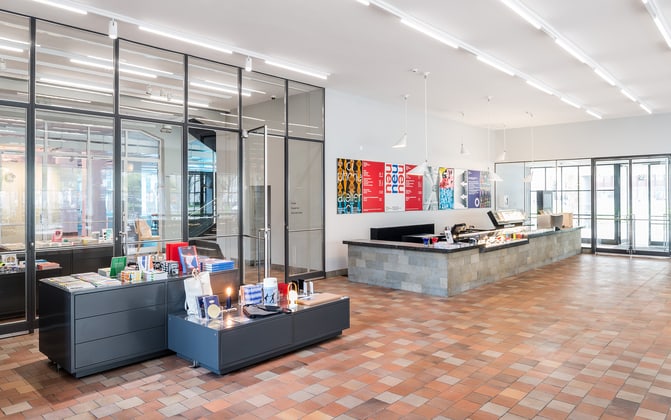
One museum, three locations: The Museum für Gestaltung Zürich faced the challenge of many visitors being unaware of its multiple sites. In addition to its main building on Museumstrasse, the museum also curates spaces at the Toni-Areal and, during the summer months, the Pavillon Le Corbusier on Lake Zurich.
-
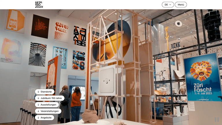
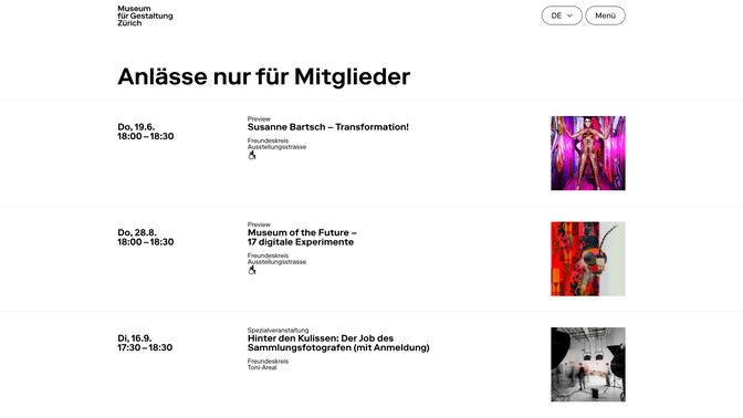
Diverse events, frequently updated: Many users were unaware of the rich variety of events offered. Alongside major, long-running exhibitions, the museum also hosts numerous smaller, exciting and current events including guided tours, excursions and discussions.
-
Meeting the needs of diverse audiences: To better engage a wide range of visitor groups, accessibility and inclusive communication had to be thoroughly analysed and addressed. UX was key to achieving this.
Design reduction vs. digital function
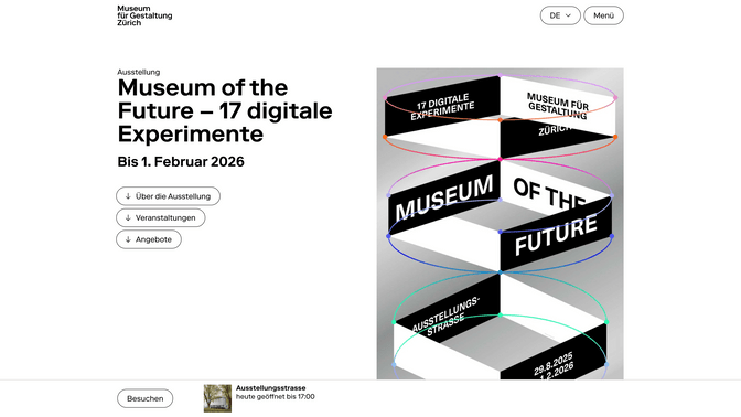
When UX and UI are in harmony, they form an intelligent and timeless design system. But getting there meant confronting several challenges and expectations: How much visual reduction in the UI is acceptable for users? How much can we strip away while keeping all key functions visible? How do we ensure users can always find their way – quickly and intuitively?
And most of all: How can we create a digital museum experience that serves the content without overshadowing it? Together with our visually ambitious client, we worked to develop a shared understanding of what digital flexibility means.
UX and UI design are part of our core expertise. In this project, we had to meet aesthetic expectations and user needs equally, without prioritising one over the other. So the real challenge was: how do we bring all of these perspectives together to deliver the best possible experience for every user?
Understanding and translating the language of the other person
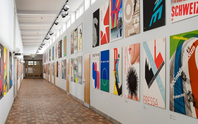
We refreshed our knowledge of design history and began with analogue research, exploring libraries and diving deep into the roots of Swiss graphic design. We focused on functionality, strict grid systems, minimalism, precision, and a thoughtful interplay of text and image.
Through a series of collaborative workshops with stakeholders and decision-makers, we developed a common visual language and a reflected design system that provides clarity and orientation at every interaction.
Encouraging and raising awareness of digital transformation
One of our central tasks was translating analogue thought patterns into a digital language and guiding our client through this transformation, highlighting both opportunities and limitations.
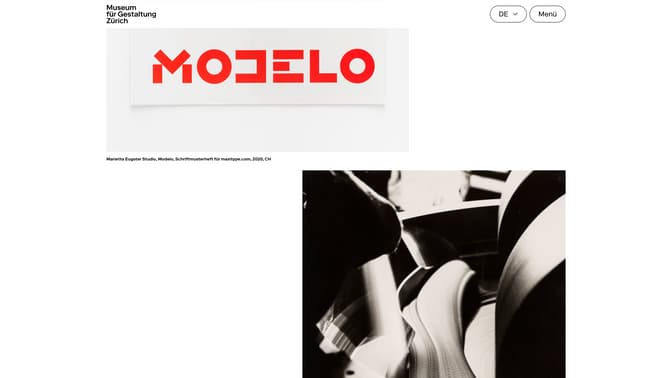
We ensured the image gallery followed the strict and minimalist layout grid. To strengthen clarity, we deliberately used just three font sizes. Texts were often combined with complementary imagery to highlight the richness of the museum’s offering, while making sure that the emotional resonance and character of the experience were retained across all screen sizes and formats.
(The header image is legally owned by the Museum für Gestaltung Zürich)