

Approach – from print to digital
Transforming a print format into a digital one brings both new opportunities and challenges. The biggest advantage is increased flexibility. Thanks to digitisation, facts & figures can now be continuously updated and distributed more easily.
In collaboration with the design agency Usable Brands, we reinterpreted existing visualisations from the print medium for a digital, responsive format. A key challenge here was to generalise possible exceptions and find reusable components that could cover as many cases as possible.
In iterative steps, we supplemented the design process with a digital prototype in order to test and improve the actual experience in the digital environment.
Data, data, data
One of the challenges we faced was that the final data was not yet available during the development phase. We were able to test the visualisations with test data from previous years, but clarity about the requirements only developed in the course of the project, as the data was delivered and processed.
Responsive design for interactive charts
We paid particular attention to ensuring that the solution could be scaled as data changed and that editors could customise the display of data in alignment with the CI/CD guidelines.
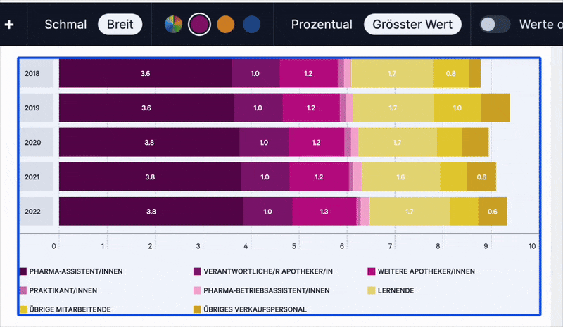
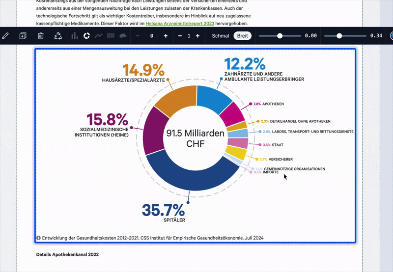
Since both data and the size of users' devices can vary, we developed solutions that optimise the charts with a mobile-first approach, ensuring they work seamlessly on smartphones as well as on desktop devices. For very small datasets, we do not use labels and only display them when interacted with. On mobile, row labels appear above the row, while on desktop, we make use of the available space and display them at the beginning of each row. Particularly long line charts are made accessible on mobile devices by horizontal scrolling, while on desktop devices, the full chart is visible at once. The donut charts benefit from the fact that we scale the labels according to the size of the pie slice, small values are displayed with smaller labels and larger values with larger labels.
Result
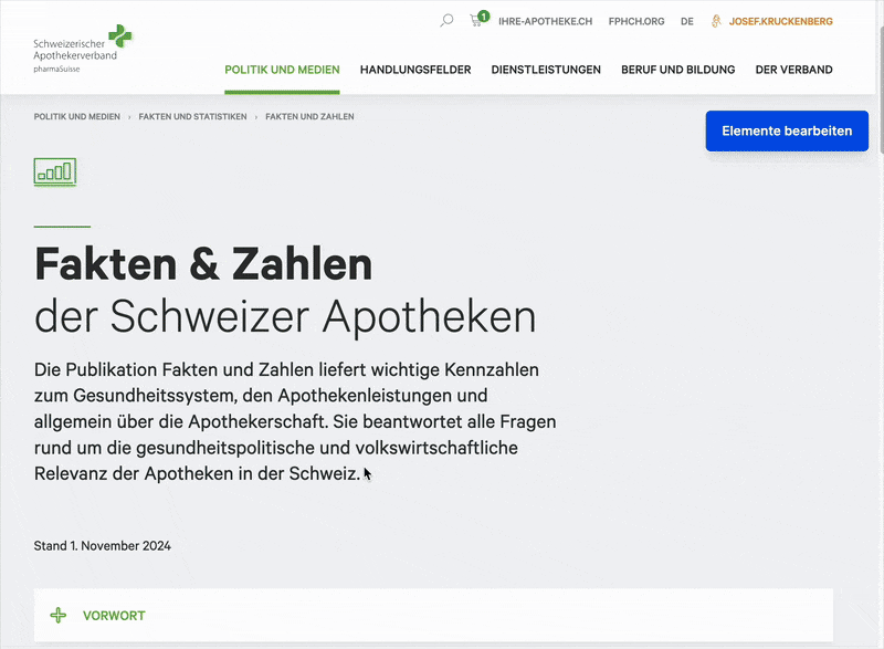
You can visit Fakten und Zahlen at the pharmaSuisse website.
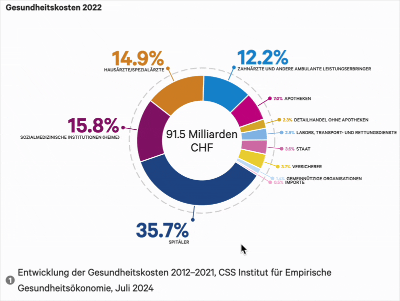
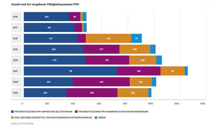
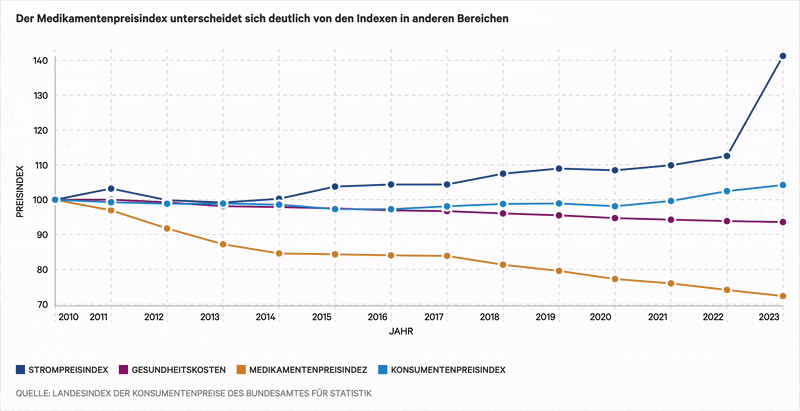
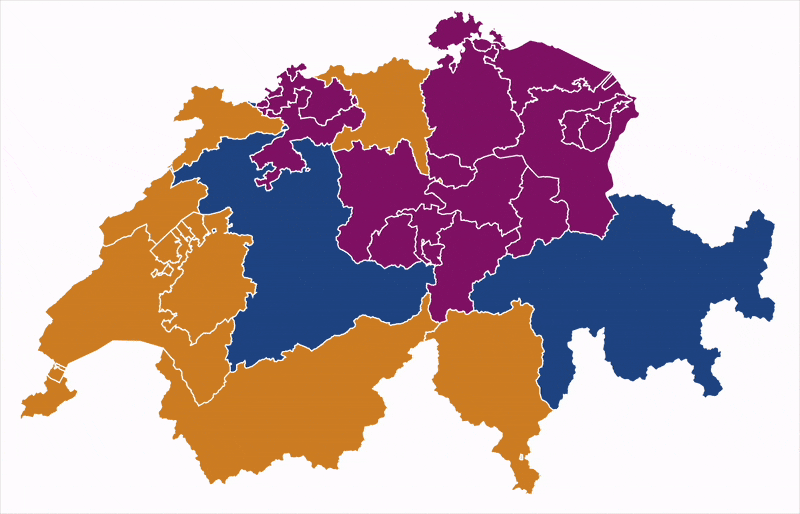
Below are some examples of how the facts and figures were visualized:
Editorial experience
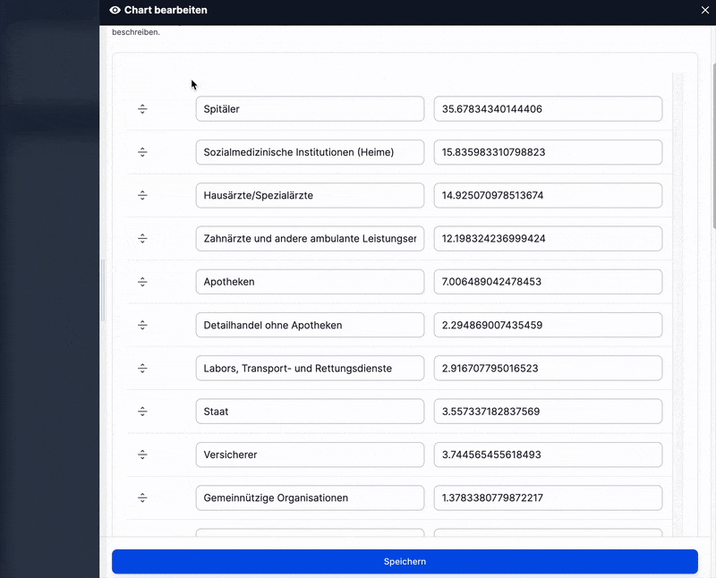
To support efficient design and data preparation, we extended the blökkli editor to include chart functions. First, the data is uploaded in a structured form, for example, as a CSV file.
In a second step, the editorial team can interactively prepare the structured data in blökkli. Predefined colour palettes and adjustable sliders make it easier to fine-tune the positioning and visual presentation of the data.
Charts can also be exported as PDF files. Editors can manually set line breaks to optimise the layout of the chart pages.
Outlook
The interactive charts for pharmaSuisse have been successfully released and are continuously updated. pharmaSuisse benefits in that facts can be sent directly via digital channels and updated regularly. We are currently planning the second iteration, with improvements focused on interaction and readability.
Many thanks to pharmaSuisse for the trust and collaboration. Thank you, Usable Brands, as well as Jan Hug and Jens Vranckz from our team, for the implementation! We’re excited to continue developing engaging visualisations for facts and figures.