
We started working with Retraites Populaires in spring 2020, after we defined what would become their new front-end stack together: Vue.js on TypeScript. It was stated that we would build the interface on Vuetify, a large and popular open-source component library. Since our targeted applications were mostly internal, where strict branding guidelines are less important, ready-to-use components were a better option than building everything from scratch.
We spent a couple of sprints together building a first app that was targeting an API they would build in parallel internally. Successfully, the application went live while we were already looking into our next collaboration with Retraites Populaires some months later. Another app was in the pipeline, using Vue.js too and of course it was time to think about how to share the common parts.
Component libraries challenges and solutions
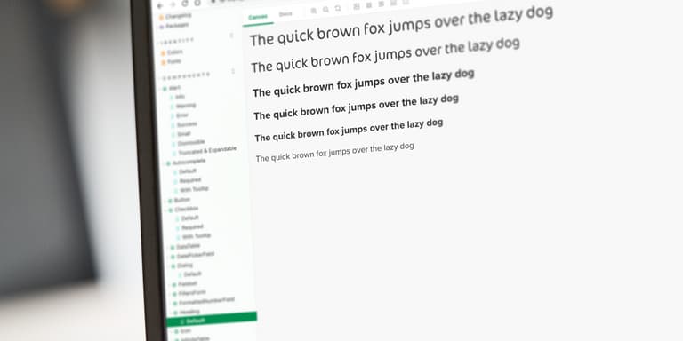
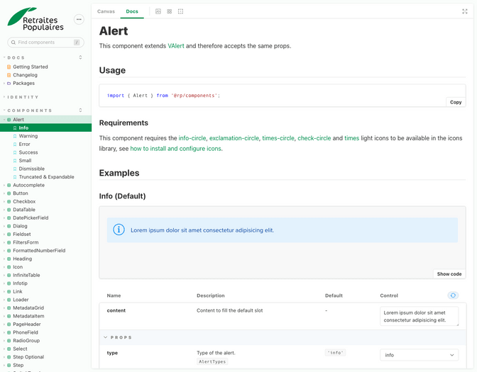
The main problem when extracting code is you start losing context. What does it look like? How does it work? That’s why we couldn’t just put the code away in a separate repository, we had to showcase and document it. No need to think twice, we’ve been satisfied using Storybook for a while now and it was a perfect fit here too. It integrates seamlessly with Vue.js through its auto-documentation of components’ API while giving us total freedom to document anything else using plain Markdown.
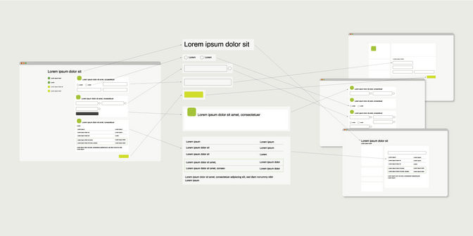
From visual components to form validation rules, everything that would be helpful to build new apps would be centralized in this components library. But documentation isn’t the only requirement to make it last, we also need to ensure quality. A change in the library shouldn’t cause bugs once updated into the projects. To prevent that kind of issue, we write unit and integration tests for all the features. The test suites run automatically every time we change some code and avoid regressions.
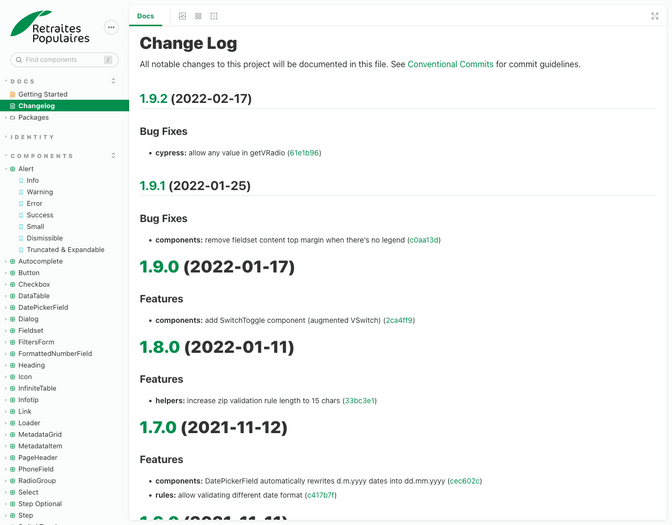
Another process we are committed to, is versioning. Every time we change something in the code base, we label it in a standard way (bug, feature, refactor, …). This enables us to generate what developers call a “changelog” and create releases following semantic versioning automatically. It gives a clear overview of the changes which helps to update the library in all the projects that use it afterwards.
A real asset
Component libraries require effort to be qualitative and serve their purpose. Luckily a lot of tools exist already to streamline processes. If done well, they provide an invaluable asset to ensure consistency and reduce development time overall. They also enable an upfront iteration process of prototyping and testing new features common to multiple apps before releasing them.
We have already developed four different webapps with Retraites Populaires using their component library and that’s only the start. During this process, we made 42 releases including dozens of changes which were, except for one single breaking change, introduced seamlessly in all apps just by updating the component library version.
5 reasons why a components library is for you too
As described above a components library is a living document generated straight from the source code. This helps to have a clear basis on the visual and the code level. The alignment between UX Experts and Developers makes things easier in collaboration. And why is that useful for you?
- You are saving time and money because the application can be developed in a modular way. Once the library exists it’s a living document for all your developers and can be used for every project you hand over to an agency.
- You have a single central reference that is always up to date, for all stakeholders, and everyone sees the same thing.
- It’s easier to anticipate all the usability, accessibility and mobile compatibility aspects upstream as all the components are developed and presented closer to their final state and context.
- Maintenance is easier, and the overall quality of the projects using the style guide is improved and controlled.
- And let's be honest: having efficient tools brings pleasure to everyone's work.
Flexibility in whom you work with or who is working on the project is a given. No matter if you change the agency or if you have new frontenders in the team to be onboarded, the style guide helps to hand over an existing project. If your company is struggling to maintain multiple applications that should provide the same level of delightful experience, quality and accessibility, reach out to us!