

Speaking of CSS frameworks today, the first thing coming to people's mind is usually Bootstrap. It's not surprising, Bootstrap is a great toolbox removing most of the interface pain for developers that are not really into, you know, front-end stuff. It comes with useful and flexible JavaScript plugins, many components but especially and essentially a lot of styling. Probably the reason of its popularity, it's also the reason why I prefer avoiding it.
When you have to implement a custom design for a website, the default styling of the framework doesn't really matter. Even worse, you would have to override it and adding an extra declaration to your CSS is never good. I'm not saying it's always bad though; if you have to quickly build a private admin interface or a prototype, it can be very useful. Sadly that's rarely the case for our clients projects.
However starting with a blank stylesheet would be as bad. It's still a hassle to vertically align things, make container grows and shrinks, etc. This will probably change once Flexbox and Grid Layout are widely supported but at the moment we need some basic tools to create layouts easily. This is the reason Kanbasu has been created for.
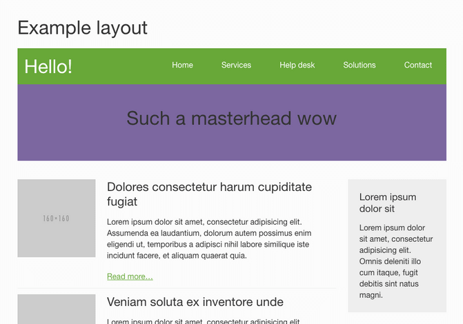
Example of layout built only with Kanbasu
If you know it already you would probably think about Inuit.css right know, the awesome framework Harry Roberts created. Good pick, it's totally inspired by it. The problem is, the latest version is in alpha for months and even if its totally working and stable, I find it painful to use for two main reasons: the first being the lack of documentation; I could personally live with it but I'm not sure my back-end colleagues would appreciate. Also this idea of splitting all the components into dozens of repositories makes any new project painful to setup.
So what's in?
Kanbasu comes with all the most popular layouts used on the web today ready to use and customize with your own style, including:
- A responsive grid based on 4 breakpoints with independent flexible widths as ratios (default up to sixths but customizable) so you can use them for any kind of block element
- Many helpers to: position elements, display content depending on breakpoints, add responsive spacings (padding or margin on any side of an element), change font style, etc.
- Must-have components such as: buttons, inline and stacked lists, the media object, responsive embeds and even table-like display to vertically align content or make it fill the space evenly.
The overall is based on customizable spacing settings (tiny, small, normal, large and huge) which apply to most components for flexibility and visual coherence.
All those are generated with Sass based on settings ready to override. Each component is in a separated file, making it easy to disable when not relevant to your project. Everything is documented and the code is entirely available on Github.
Follow the instructions to start.