

Since Gutenberg blocks are built as independent components they can be used in every layout and can be combinend however it fits your design.
This is a very common practice nowadays. But sometimes you would like to group a bunch of blocks and change the appearance or behaviour of them at once.
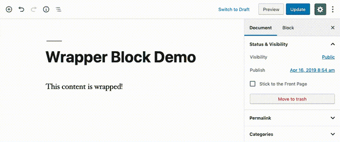
In this tutorial we're going to write a wrapper block which adds a background color around its child blocks.
This is how it will look like when it's finished:
Register new block type
To begin with we need to register a new block type. If you haven't done this before you can use the create-guten-block npm script which helps you bootstrap a new block and sets up an asset build pipeline with Webpack.
const { __ } = wp.i18n; // Import __() from wp.i18n
const { registerBlockType } = wp.blocks; // Import registerBlockType() from wp.blocks

registerBlockType( 'wrapper-block-example/wrapper-block', {
    // Block name. Block names must be string that contains a namespace prefix. Example: my-plugin/my-custom-block.
    title: __( 'Background', 'wrapper-block-example' ), // Block title.
    icon: 'editor-table', // Block icon from Dashicons → https://developer.wordpress.org/resource/dashicons/.
    category: 'layout', // Block category — Group blocks together based on common traits E.g. common, formatting, layout widgets, embed.
    keywords: [
        __( 'Background', 'wrapper-block-example' ),
        __( 'Wrapper Block', 'wrapper-block-example' ),
    ],

    attributes: {
        // Register bgColor attribute to save the chosen color
        bgColor: {
            type: 'string',
        },
    },

    // Will be implemented afterwards
    edit() {
        return null;
    },

    // Will be implemented afterwards
    save() {
        return null;
    },
} );
We register our new block wrapper-block-example/wrapper-block with the registerBlockType function and pass in the block configuration (eg. title, description, etc.).
Additionally we register a block attribute called bgColor. In this attribute we will save the chosen background color when our block is used.
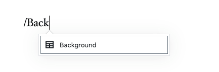
With this our block can already be inserted in the editor:
Edit function of our block
In the edit function of our block we create a SelectControl where the background color can be chosen. This control saves its value to the bgColor attribute when it's changed.
First we need to load the dependencies (at the top of the file):
import classNames from 'classnames'; // Used to to join classes together

const {
    Fragment, // Used to wrap our edit component and only have one root element
} = wp.element;
const {
    InnerBlocks, // Allows it to place child blocks inside our block
    InspectorControls, // We place our select control inside the inspector contorls which show up on the right of the editor
} = wp.editor;
const {
    PanelBody, // A panel where we place our select control in (creates a colapsable element)
    SelectControl, // Our select control to choose the background color
} = wp.components;
Now we can implement the edit function:
edit( { attributes, setAttributes, className } ) {
const {
bgColor = '',
} = attributes;
return (
<Fragment>
<InspectorControls>
<PanelBody
title={ __( 'Background Color', 'wrapper-block-example' ) }
initialOpen={ true }
>
<SelectControl
label={ __( 'Background Color', 'wrapper-block-example' ) }
value={ bgColor }
options={ [
{
value: '',
label: __( 'No Background Color', 'wrapper-block-example' ),
},
{
value: 'paleturquoise',
label: __( 'Light Blue', 'wrapper-block-example' ),
},
{
value: 'orange',
label: __( 'Orange', 'wrapper-block-example' ),
},
] }
onChange={ ( selectedOption ) => setAttributes( { bgColor: selectedOption } ) }
/>
</PanelBody>
</InspectorControls>
<div
className={ className }
style={ { backgroundColor: bgColor } }
>
<InnerBlocks />
</div>
</Fragment>
);
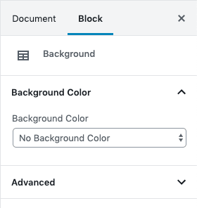
},We add the background selection inside the inspector controls of the block. With this implementation we're now able to select a background color of our block:
The most important part (next to the SelectControl of course) is the <InnerBlocks /> component which we add at the end of the edit function. This component allows us to place child blocks inside our block. Read everything about InnerBlocks here: https://github.com/WordPress/gutenberg/tree/master/packages/block-editor/src/components/inner-blocks
Save function
In the save function of our block we need to add the <InnerBlocks.Content /> component which passes through the content of its child blocks.
Additionally we add a background-color style property with the chosen color to its wrapper div and set a bg-<chosen-color> class to be able to style the child blocks via CSS (eg. change text color when a dark background is selected). We only render these attributes when a background color is selected.
save( { attributes, className } ) {
    const {
        bgColor = '',
    } = attributes;

    let styles = {};
    let classes = className;

    // Only set attributes when background color is chosen
    if ( '' !== bgColor ) {
        styles = { backgroundColor: bgColor, padding: '10px' };
        // Use classnames library to join all classes together
        classes = classNames( `bg-${ bgColor }`, classes );
    }

    return (
        <div
            className={ classes }
            style={ styles }
        >
            <InnerBlocks.Content />
        </div>
    );
},
Wrap up
As you see writing a wrapper block in Gutenberg is quite simple. All you need to do is using the <InnerBlocks> feature of Gutenberg.
You'll find the complete code of this example packed as a fully functional WordPress plugin here: https://github.com/liip/wrapper-block-example-wp-plugin