
About NEXPLORER
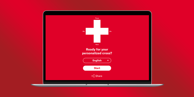
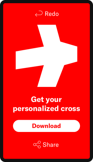
Your answers determine the importance of some predefined core values. Each corner of the Swiss cross represents one of those values. Values that are less important to you move a corner toward the center. Conversely, the more important a value is to you moves that corner outward.
As soon as you have answered all questions, your very own unique Swiss cross is generated and ready for sharing or downloading.
Focus of blogpost
The design choices explained in this post will hopefully inspire you as a designer to think of new patterns for old challenges like polls and considerations when designing for a vast array of users.
Design Challenge
My challenge from a design perspective was to make filling out a questionnaire with 40+ questions a fast and accessible experience for young and old.
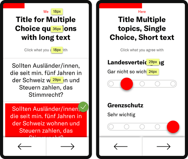
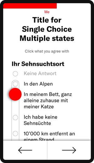
Early prototype showing the start screen, all question types and Swiss cross generation at the end
Accessibility First
Dealing with users ranging from teens to elderly poses unique challenges in regards to legibility, clickability and devices used. It was paramount that the survey was accessible for everyone, especially on mobile and doesn’t require precision input.
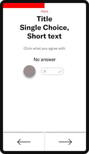
Keeping in mind elderly users, I opted for big interactive elements, easy to interact with. Clicked answers change color and slightly shrink in size to visually illustrate their changed state.
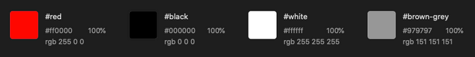
To help users with degraded eyesight I used a high contrast color palette, limited to red, black, white and grey. I used red for all elements that have been actively selected by the user, making them easily distinguishable from passive and non-selectable elements in grey.
Prioritize Legibility
Given the amount of possible answers per question users have to retain a lot of information to make a decision. As designers we therefore have to strike a balance between making text big enough to be easily legible, while at the same time not using up too much real estate on the screen.
I mainly used font-sizes ranging from 24–36px for all major elements and set less important text to 18px.
Limit UI patterns
Creating digital experiences for such a broad user group forces you as a designer to limit the amount of interaction paradigms that users have to learn. This is especially important for users that are not tech-savvy and have limited experience with the newest technology.
For this reason we used a total of two different interactive elements, large buttons and sliders.
Below are some examples of the various types of questions.
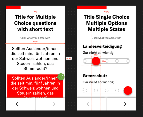
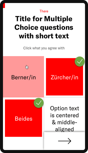
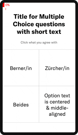
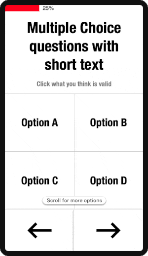
Multiple Choice questions with short text
Multiple choice questions with answers that consist of one to three words use a two-column layout on mobile devices. This allows the user to scan 4-6 possible answers at any given time – balancing the amount of content and the retention of information to make a decision.
The final text however ended up being much longer, which is why we implemented a one column layout for mobile instead.
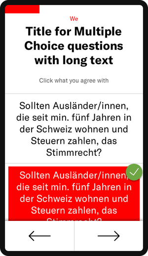
Multiple Choice questions with long text
For this type of question we decided to group questions with long answers in a scrollable one-column stack on mobile devices. This prevents the text from being crammed into fixed-height boxes.
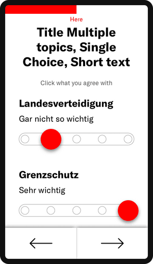
Questions with Multiple topics, Single Choice & Short text
For this type of question I decided to use a range slider with an oversized drag handle easy to grab. Answers here have generally fairly short text, spanning from ‘Not important at all’ to ‘Very important’ and are always the same for each topic.
Unlike traditional table components widely used for this case, our design approach rewards each sub-topic with breathing space inbetween.
One topic, Single Choice, Long text
This fourth kind of UI pattern, similar to the one above, is designed for topics with much longer text. Despite that, it was important to give users a good overview over the majority of possible answers, even on small devices.
Switches
This last pattern once again uses the slider element and just like with the previous pattern the user has the option to not give an answer, which was an important input we got from the client and test user side.
Efficient navigating
To make navigating through the large number of questions as swift as possible, I put two simple buttons at the bottom of the screen, easily reachable with the thumb for any user.
Explain change visually
I’m personally a big lover of micro-animations as they allow you to visually tell the user about change. As a UX designer, you are a storyteller, with your UI elements as the protagonists. So just like object in nature (outside the world of quantum physics of course) UI elements equally should not pop up or change state instantaneously without any transition. Having a beginning and an end animation makes it much easier to understand the change a user’s action causes.
This animation shows the transition between chapters
Details matter
While experienced Mobile users might naturally scroll down to see if there’s more content below, we wanted to encourage inexperienced users too to explore all possible answers. For this matter a little text hint pops up right at the beginning, drawing the user's eyes to it. On scrolling down that hint then disappears again.
Early animation prototype that shows a hint when more content in below the fold
Doing over talking
It’s important to know that you as creative service providers bring value by translating requirements into interactive experiences. More and more I realize that we designers often have the tendency to get lost in the UX process and its methods. Instead we should ask ourselves how much information really needs to be gathered.
With Prototyping projects especially, the speed of learning is key. Identify the problem, design a first solution, test it and apply what you’ve learned.
At Liip when we do prototyping workshops or at initial client meetings, we often use our Turbo Canvas. It allows us to capture the most relevant information to get an overview of a project. Try it out and share your experience #turbocanvas #liip.
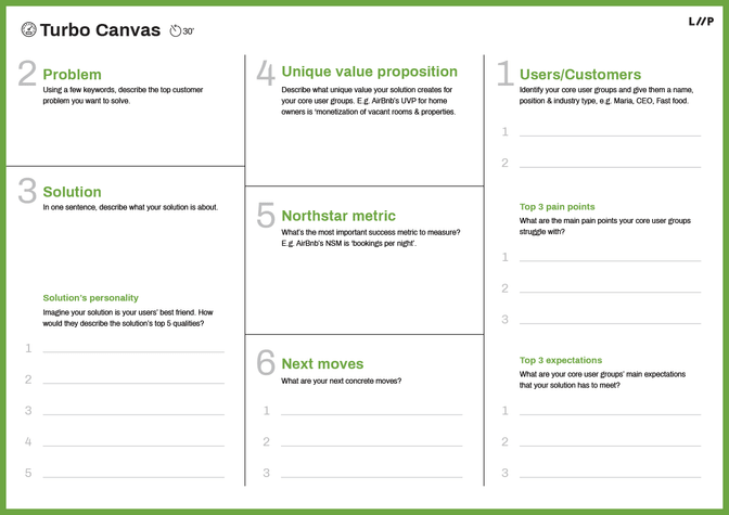
Liip Turbo Canvas for capturing the most relevant information
Co-creating with your developer = ❤️
As designers and innovators we often fall in love with our solutions. It’s ok to admit, we’re all guilty of that. It’s therefore important to avoid crafting elaborate designs only to be told they’re not feasible. My tip for you: From the beginning, co-create your ideas together with a developer that is fluent in UI animations. This will save you tons of frustrations (and cursing). You will additionally learn the capabilities and limitations of various frameworks and build a stronger relationship with your developer on top. A true win-win situation.
Learnings
With this prototype, I realized once again how important it is:
- to capture the most relevant information as quickly as possible
- not to overthink or overengineer anything
- to limit the amount of interaction paradigms
- to regard your designs as a starting point to fluidly refine with your developer, as implementation with final content differs almost always from what you’ve initial designed
Furthermore, it is tremendously beneficial to be working with a client that grants you free rein in the creative direction and is able to make decisions quickly.
Finally, when you do prototyping projects keep your and the client’s focus on learning, and not perfecting.
Further links
Read Pascal Thormeier’s blog post about the technology behind: NEXPLORER or a steep learning curve.