

We won't go into detail in the basic block creation since there are already lots of tutorials about this topic available. We will focus on the image selector instead.
Behaviour of the image selector
Before we start we need to think about in which states our image selector can be:
- When we first add the block there is no image selected. In this case we need to render a button which opens the media library where we can upload a new image or select an existing one.
- As soon as we upload or select an image this image gets fetched from the server. During this time we will render a loading spinner.
- When the image was selected and successfully loaded we will display it with the possibility to replace or remove the image.
Setup basic block
We start with a basic Gutenberg block (block.js) which has a single attribute bgImageId where we'll save the background image ID as soon it is selected. The ImageSelectorEdit component (edit.js) uses the InnerBlocks component to provide the possibilty to add blocks inside of it and a placeholder for our image selector inside the InspectorControls:
// block.js

import edit from './edit';

const { __ } = wp.i18n;
const { registerBlockType } = wp.blocks;
const { InnerBlocks } = wp.editor;

registerBlockType( 'image-selector-example/image-selector', {
    title: __( 'Image Selector Example', 'image-selector-example' ),
    icon: 'format-image',
    category: 'common',
    keywords: [
        __( 'Image Selector', 'image-selector-example' ),
    ],

    supports: {
        align: [ 'full' ],
    },

    attributes: {
        bgImageId: {
            type: 'number',
        },
    },

    edit,

    save() {
        return (
            <InnerBlocks.Content />
        );
    },
} );
// edit.js
// Load dependencies
const { __ } = wp.i18n;
const { Component, Fragment } = wp.element;
const { InspectorControls, InnerBlocks } = wp.editor;
const { PanelBody } = wp.components;
export default class ImageSelectorEdit extends Component {
render() {
return (
<Fragment>
<InspectorControls>
<PanelBody
title={ __( 'Background settings', 'image-selector-example' ) }
initialOpen={ true }
>
<div className="wp-block-image-selector-example-image">
Our image selector goes here
</div>
</PanelBody>
</InspectorControls>
<div>
<InnerBlocks />
</div>
</Fragment>
);
}
}When we insert our block in the editor the InspectorControls should look like this:
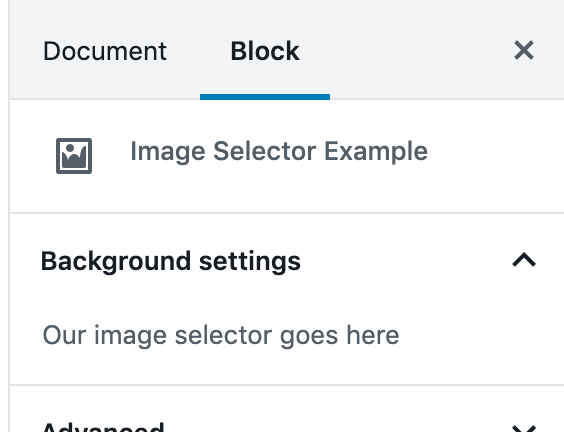
InspectorControlsSelect or upload image
To select an image from the media library or upload a new image Gutenberg provides the MediaUpload component.
Let's use it instead of our placeholder text in the InspectorControls of the ImageSelectorEdit component:
// edit.js

// Load dependencies
const { __ } = wp.i18n;
const { Component, Fragment } = wp.element;
const { InspectorControls, InnerBlocks, MediaUpload, MediaUploadCheck } = wp.editor;
const { PanelBody, Button } = wp.components;

const ALLOWED_MEDIA_TYPES = [ 'image' ];

export default class ImageSelectorEdit extends Component {
    render() {
        const { attributes, setAttributes } = this.props;
        const { bgImageId } = attributes;
        const instructions = <p>{ __( 'To edit the background image, you need permission to upload media.', 'image-selector-example' ) }</p>;

        const onUpdateImage = ( image ) => {
            setAttributes( {
                bgImageId: image.id,
            } );
        };

        return (
            <Fragment>
                <InspectorControls>
                    <PanelBody
                        title={ __( 'Background settings', 'image-selector-example' ) }
                        initialOpen={ true }
                    >
                        <div className="wp-block-image-selector-example-image">
                            <MediaUploadCheck fallback={ instructions }>
                                <MediaUpload
                                    title={ __( 'Background image', 'image-selector-example' ) }
                                    onSelect={ onUpdateImage }
                                    allowedTypes={ ALLOWED_MEDIA_TYPES }
                                    value={ bgImageId }
                                    render={ ( { open } ) => (
                                        <Button
                                            className={ 'editor-post-featured-image__toggle' }
                                            onClick={ open }>
                                            { __( 'Set background image', 'image-selector-example' ) }
                                        </Button>
                                    ) }
                                />
                            </MediaUploadCheck>
                        </div>
                    </PanelBody>
                </InspectorControls>
                <div>
                    <InnerBlocks />
                </div>
            </Fragment>
        );
    }
}
First thing you might notice is that we did not just add the <MediaUpload /> component but also wrapped it in a <MediaUploadCheck /> component. This is necessary to make sure that the current user has upload permissions. Otherwise the fallback instructions will be printed.
The <MediaUpload /> component itself takes a few noteworthy attributes:
- The
onSelectfunction gets called as soon as an image gets selected. We pass theonUpdateImagefunction which simply sets thebgImageIdattribute of our block. - In the
allowedTypesattribute we define that onlyimages can be selected. - In the
renderfunction we return aButtonwhich opens the media selector modal. - We need to pass the
bgImageIdattribute of our block as thevalueto the component so that it knows which image should be selected when the media selector modal opens.
At this point we're able to open the media selector modal from the <InspectorControls /> of our block and select an image. The ID of the selected image gets saved in the bgImageId attribute.
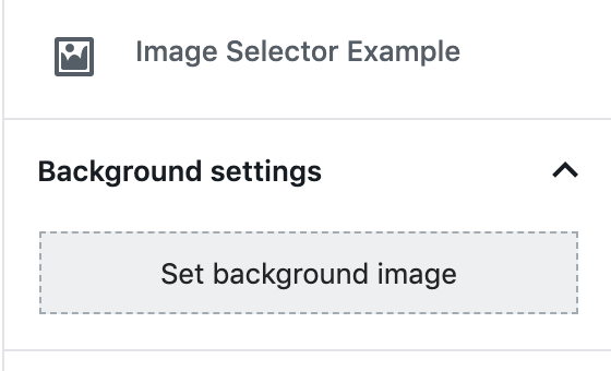
MediaUpload component inside the InspectorControlsLoading state
As soon as we select an image from the media library the image needs to be fetched from the server. During this time we would like to render a loading spinner.
To know if the image has been loaded we need to compose our ImageSelectorEdit component with the withSelect HOC. This component loads the image as soon as the bgImageId is set and re-renders our component when this is done.
The ImageSelectorEdit component now looks like this:
// edit.js

// Load dependencies
const { __ } = wp.i18n;
const { Component, Fragment } = wp.element;
const { InspectorControls, InnerBlocks, MediaUpload, MediaUploadCheck } = wp.editor;
const { PanelBody, Button, Spinner } = wp.components;
const { compose } = wp.compose;
const { withSelect } = wp.data;

const ALLOWED_MEDIA_TYPES = [ 'image' ];

class ImageSelectorEdit extends Component {
    render() {
        const { attributes, setAttributes, bgImage } = this.props;
        const { bgImageId } = attributes;
        const instructions = <p>{ __( 'To edit the background image, you need permission to upload media.', 'image-selector-example' ) }</p>;

        const onUpdateImage = ( image ) => {
            setAttributes( {
                bgImageId: image.id,
            } );
        };

        const onRemoveImage = () => {
            setAttributes( {
                bgImageId: undefined,
            } );
        };

        return (
            <Fragment>
                <InspectorControls>
                    <PanelBody
                        title={ __( 'Background settings', 'image-selector-example' ) }
                        initialOpen={ true }
                    >
                        <div className="wp-block-image-selector-example-image">
                            <MediaUploadCheck fallback={ instructions }>
                                <MediaUpload
                                    title={ __( 'Background image', 'image-selector-example' ) }
                                    onSelect={ onUpdateImage }
                                    allowedTypes={ ALLOWED_MEDIA_TYPES }
                                    value={ bgImageId }
                                    render={ ( { open } ) => (
                                        <Button
                                            className={ ! bgImageId ? 'editor-post-featured-image__toggle' : 'editor-post-featured-image__preview' }
                                            onClick={ open }>
                                            { !! bgImageId && ! bgImage && <Spinner /> }
                                            { ! bgImageId && ( __( 'Set background image', 'image-selector-example' ) ) }
                                        </Button>
                                    ) }
                                />
                            </MediaUploadCheck>
                            { !! bgImageId &&
                                <MediaUploadCheck>
                                    <Button onClick={ onRemoveImage } isLink isDestructive>
                                        { __( 'Remove background image', 'image-selector-example' ) }
                                    </Button>
                                </MediaUploadCheck>
                            }
                        </div>
                    </PanelBody>
                </InspectorControls>
                <div>
                    <InnerBlocks />
                </div>
            </Fragment>
        );
    }
}

export default compose(
    withSelect( ( select, props ) => {
        const { getMedia } = select( 'core' );
        const { bgImageId } = props.attributes;

        return {
            bgImage: bgImageId ? getMedia( bgImageId ) : null,
        };
    } ),
)( ImageSelectorEdit );
Let's go through the changes:
As already mentioned we compose our component with a withSelect HOC at the bottom of the file:
// edit.js

export default compose(
    withSelect( ( select, props ) => {
        const { getMedia } = select( 'core' );
        const { bgImageId } = props.attributes;

        return {
            bgImage: bgImageId ? getMedia( bgImageId ) : null,
        };
    } ),
)( ImageSelectorEdit );
In this function we retrieve the image with the select( 'core' ).getMedia() function when the bgImageId attribute is set. We pass this image as bgImage property to our ImageSelectorEdit component.
In the media selector button we now distinguish two states:
// edit.js

{ ! bgImageId && ( __( 'Set background image', 'image-selector-example' ) ) }
{ !! bgImageId && ! bgImage && <Spinner /> }
When no image is selected (! bgImageId) we show the Set background image button text as we already implemented it before. As soon as an image gets selected (!! bgImageId) but is not yet loaded (! bgImage) we show a loading spinner.
We also use a different styling as soon as an image is selected:
// edit.js

className={ ! bgImageId ? 'editor-post-featured-image__toggle' : 'editor-post-featured-image__preview' }
We're reusing the same styles as the PostFeaturedImage component for this since we're implementing the same behavior.
The last change we did is adding a new button below the <MediaUpload /> component to remove the image if it was selected before.
// edit.js

{ !! bgImageId &&
    <MediaUploadCheck>
        <Button onClick={ onRemoveImage } isLink isDestructive>
            { __( 'Remove background image', 'image-selector-example' ) }
        </Button>
    </MediaUploadCheck>
}
To this button we're passing a onRemoveImage click handler which sets the bgImageId attribute to undefined.
Image loaded
The last state we need to handle is the one as soon as an image has been selected and has been loaded. In this case we would like to display it and add an additional button below to replace the image.
We have to add another case for this inside our <MediaUpload /> element.
// edit.js

{ !! bgImageId && bgImage &&
    <ResponsiveWrapper
        naturalWidth={ bgImage.media_details.width }
        naturalHeight={ bgImage.media_details.height }
    >
        <img src={ bgImage.source_url } alt={ __( 'Background image', 'image-selector-example' ) } />
    </ResponsiveWrapper>
}
When an image is selected (!! bgImageId) and was sucessfully loaded (bgImage is set) we show the image inside a ResponsiveWrapper component to make it responsive to the current viewport. We get all information we need for this (naturalWidth, naturalWidth and the src) directly from the bgImage which we have loaded in the withSelect function.
Below the image we display a button which allows the user to replace the selected image.
// edit.js

{ !! bgImageId && bgImage &&
    <MediaUploadCheck>
        <MediaUpload
            title={ __( 'Background image', 'image-selector-example' ) }
            onSelect={ onUpdateImage }
            allowedTypes={ ALLOWED_MEDIA_TYPES }
            value={ bgImageId }
            render={ ( { open } ) => (
                <Button onClick={ open } isDefault isLarge>
                    { __( 'Replace background image', 'image-selector-example' ) }
                </Button>
            ) }
        />
    </MediaUploadCheck>
}
We wrap the <MediaUpload /> element in the same condition as before (!! bgImageId && bgImage => Image selected AND image loaded). The element has the exact same properties as the one we already have. The only difference is that the render function always renders the same "Replace image"-<Button /> (no state distinction).
Our ImageSelectorEdit component should now look like this:
// edit.js

// Load dependencies
const { __ } = wp.i18n;
const { Component, Fragment } = wp.element;
const { InspectorControls, InnerBlocks, MediaUpload, MediaUploadCheck } = wp.editor;
const { PanelBody, Button, ResponsiveWrapper, Spinner } = wp.components;
const { compose } = wp.compose;
const { withSelect } = wp.data;

const ALLOWED_MEDIA_TYPES = [ 'image' ];

class ImageSelectorEdit extends Component {
    render() {
        const { attributes, setAttributes, bgImage } = this.props;
        const { bgImageId } = attributes;
        const instructions = <p>{ __( 'To edit the background image, you need permission to upload media.', 'image-selector-example' ) }</p>;

        const onUpdateImage = ( image ) => {
            setAttributes( {
                bgImageId: image.id,
            } );
        };

        const onRemoveImage = () => {
            setAttributes( {
                bgImageId: undefined,
            } );
        };

        return (
            <Fragment>
                <InspectorControls>
                    <PanelBody
                        title={ __( 'Background settings', 'image-selector-example' ) }
                        initialOpen={ true }
                    >
                        <div className="wp-block-image-selector-example-image">
                            <MediaUploadCheck fallback={ instructions }>
                                <MediaUpload
                                    title={ __( 'Background image', 'image-selector-example' ) }
                                    onSelect={ onUpdateImage }
                                    allowedTypes={ ALLOWED_MEDIA_TYPES }
                                    value={ bgImageId }
                                    render={ ( { open } ) => (
                                        <Button
                                            className={ ! bgImageId ? 'editor-post-featured-image__toggle' : 'editor-post-featured-image__preview' }
                                            onClick={ open }>
                                            { ! bgImageId && ( __( 'Set background image', 'image-selector-example' ) ) }
                                            { !! bgImageId && ! bgImage && <Spinner /> }
                                            { !! bgImageId && bgImage &&
                                                <ResponsiveWrapper
                                                    naturalWidth={ bgImage.media_details.width }
                                                    naturalHeight={ bgImage.media_details.height }
                                                >
                                                    <img src={ bgImage.source_url } alt={ __( 'Background image', 'image-selector-example' ) } />
                                                </ResponsiveWrapper>
                                            }
                                        </Button>
                                    ) }
                                />
                            </MediaUploadCheck>
                            { !! bgImageId && bgImage &&
                                <MediaUploadCheck>
                                    <MediaUpload
                                        title={ __( 'Background image', 'image-selector-example' ) }
                                        onSelect={ onUpdateImage }
                                        allowedTypes={ ALLOWED_MEDIA_TYPES }
                                        value={ bgImageId }
                                        render={ ( { open } ) => (
                                            <Button onClick={ open } isDefault isLarge>
                                                { __( 'Replace background image', 'image-selector-example' ) }
                                            </Button>
                                        ) }
                                    />
                                </MediaUploadCheck>
                            }
                            { !! bgImageId &&
                                <MediaUploadCheck>
                                    <Button onClick={ onRemoveImage } isLink isDestructive>
                                        { __( 'Remove background image', 'image-selector-example' ) }
                                    </Button>
                                </MediaUploadCheck>
                            }
                        </div>
                    </PanelBody>
                </InspectorControls>
                <div>
                    <InnerBlocks />
                </div>
            </Fragment>
        );
    }
}

export default compose(
    withSelect( ( select, props ) => {
        const { getMedia } = select( 'core' );
        const { bgImageId } = props.attributes;

        return {
            bgImage: bgImageId ? getMedia( bgImageId ) : null,
        };
    } ),
)( ImageSelectorEdit );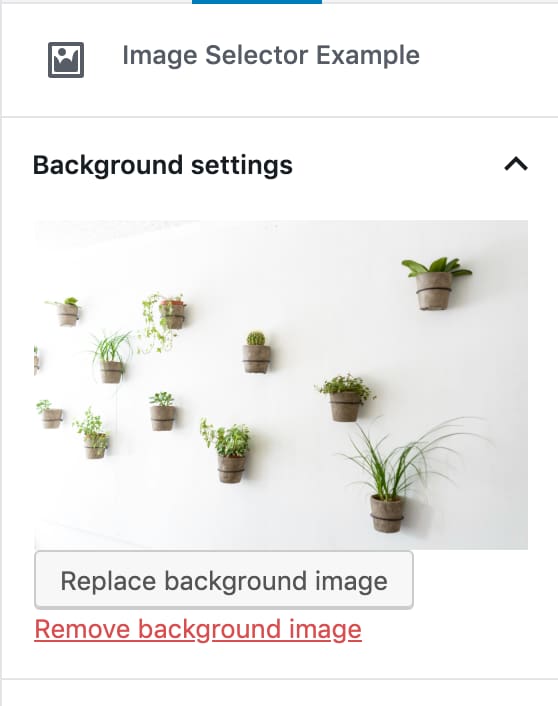
Make it look nice
Our image selector doesn't look very nice till now. Let's add some styles to fix that.
// styles.scss

.wp-block-image-selector-example-image {
    .components-spinner {
        margin: 0;
        float: none;
    }

    // Space consecutive buttons evenly.
    .components-button + .components-button {
        margin-top: 1em;
        margin-right: 8px;
    }
}
To make the background image visible in the editor we can add it with the style attribute to the <div> which wraps the <InnerBlocks /> component.
For this we first need to additionally get the className attribute from the components props and prepare the styles attribute depending on if a background image is set or not:
// edit.js

const { attributes, setAttributes, bgImage, className } = this.props;

let styles = {};
if ( bgImage && bgImage.source_url ) {
    styles = { backgroundImage: `url(${ bgImage.source_url })` };
}
Now we can add the className and the styles attribute to the wrapper <div>:
// edit.js

<div
    className={ className }
    style={ styles }
>
    <InnerBlocks />
</div>
Add the following style to the styles.scss file to position the background inside the block:
// styles.scss

.wp-block-image-selector-example-image-selector {
    background-repeat: no-repeat;
    background-position: center;
    background-size: cover;
}
The final ImageSelectorEdit component looks like this:
// edit.js

// Load dependencies
const { __ } = wp.i18n;
const { Component, Fragment } = wp.element;
const { InspectorControls, InnerBlocks, MediaUpload, MediaUploadCheck } = wp.editor;
const { PanelBody, Button, ResponsiveWrapper, Spinner } = wp.components;
const { compose } = wp.compose;
const { withSelect } = wp.data;

const ALLOWED_MEDIA_TYPES = [ 'image' ];

class ImageSelectorEdit extends Component {
    render() {
        const { attributes, setAttributes, bgImage, className } = this.props;
        const { bgImageId } = attributes;
        const instructions = <p>{ __( 'To edit the background image, you need permission to upload media.', 'image-selector-example' ) }</p>;

        let styles = {};
        if ( bgImage && bgImage.source_url ) {
            styles = { backgroundImage: `url(${ bgImage.source_url })` };
        }

        const onUpdateImage = ( image ) => {
            setAttributes( {
                bgImageId: image.id,
            } );
        };

        const onRemoveImage = () => {
            setAttributes( {
                bgImageId: undefined,
            } );
        };

        return (
            <Fragment>
                <InspectorControls>
                    <PanelBody
                        title={ __( 'Background settings', 'image-selector-example' ) }
                        initialOpen={ true }
                    >
                        <div className="wp-block-image-selector-example-image">
                            <MediaUploadCheck fallback={ instructions }>
                                <MediaUpload
                                    title={ __( 'Background image', 'image-selector-example' ) }
                                    onSelect={ onUpdateImage }
                                    allowedTypes={ ALLOWED_MEDIA_TYPES }
                                    value={ bgImageId }
                                    render={ ( { open } ) => (
                                        <Button
                                            className={ ! bgImageId ? 'editor-post-featured-image__toggle' : 'editor-post-featured-image__preview' }
                                            onClick={ open }>
                                            { ! bgImageId && ( __( 'Set background image', 'image-selector-example' ) ) }
                                            { !! bgImageId && ! bgImage && <Spinner /> }
                                            { !! bgImageId && bgImage &&
                                                <ResponsiveWrapper
                                                    naturalWidth={ bgImage.media_details.width }
                                                    naturalHeight={ bgImage.media_details.height }
                                                >
                                                    <img src={ bgImage.source_url } alt={ __( 'Background image', 'image-selector-example' ) } />
                                                </ResponsiveWrapper>
                                            }
                                        </Button>
                                    ) }
                                />
                            </MediaUploadCheck>
                            { !! bgImageId && bgImage &&
                                <MediaUploadCheck>
                                    <MediaUpload
                                        title={ __( 'Background image', 'image-selector-example' ) }
                                        onSelect={ onUpdateImage }
                                        allowedTypes={ ALLOWED_MEDIA_TYPES }
                                        value={ bgImageId }
                                        render={ ( { open } ) => (
                                            <Button onClick={ open } isDefault isLarge>
                                                { __( 'Replace background image', 'image-selector-example' ) }
                                            </Button>
                                        ) }
                                    />
                                </MediaUploadCheck>
                            }
                            { !! bgImageId &&
                                <MediaUploadCheck>
                                    <Button onClick={ onRemoveImage } isLink isDestructive>
                                        { __( 'Remove background image', 'image-selector-example' ) }
                                    </Button>
                                </MediaUploadCheck>
                            }
                        </div>
                    </PanelBody>
                </InspectorControls>
                <div
                    className={ className }
                    style={ styles }
                >
                    <InnerBlocks />
                </div>
            </Fragment>
        );
    }
}

export default compose(
    withSelect( ( select, props ) => {
        const { getMedia } = select( 'core' );
        const { bgImageId } = props.attributes;

        return {
            bgImage: bgImageId ? getMedia( bgImageId ) : null,
        };
    } ),
)( ImageSelectorEdit );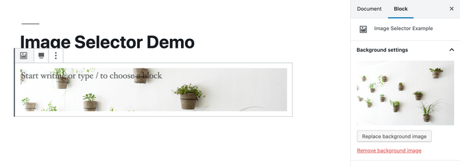
And we're done!
That's it! We implemented a custom Gutenberg block with a background image selector.
This tutorial is also available as a WordPress plugin on GitHub: https://github.com/liip/image-selector-example-wp-plugin. Feel free to use it as a starting point to implement an image selector for your own Gutenberg block.