
Context
Raiffeisen, Switzerland’s third-largest bank, is in the process of digital transformation. To push things forward, they put two experienced women at the helm of their Digital Business (Laure Frank, Director Digital Business, and Jana Nobel, Head of Customer Experience). Under their leadership, a new Tone of Voice also emerged. At the core of the new Tone of Voice is human-centric language. One concrete consequence of this is that UX Writing is a key focus in all new projects.
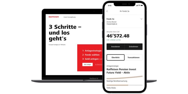
The new Tone of Voice was applied during the development of the new retirement app. The idea behind the app is to encourage customers to put their retirement savings into an active investment fund rather than their passive retirement account. Investing pension money benefits both the retiree and the bank. With the new Tone of Voice at hand, the UX Writing team set out to make the language in the retirement app simple, understandable, and human-centric (user need) to create a smooth onboarding process and, consequently, higher conversion rates (business need).
User Flow
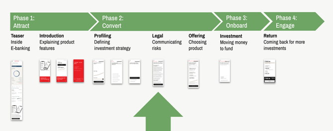
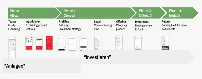
The user flow describes the different phases our customers go through when starting a pension investment fund. For our case study, we will take Emma Meyer as our example customer. Emma is already a Raiffeisen customer and is familiar with the bank’s mobile banking system. She will go through the four phases in our user flow and will have an active fund at the end.
User Flow Overview
- Phase 1: Attract promotes the new retirement app with a teaser and explanatory screens.
- Phase 2: Convert helps to find the right investment strategy. Before Emma agrees to an investment plan, the Convert phase also informs her about the risks of investing.
- Phase 3: Onboard leads Emma to making her first investment.
- Phase 4: Engage is our end goal: Emma has become an investor. In her mobile banking account, she can view the performance of her investment.
The Reality
What looks like a super tidy process doesn’t quite correspond to reality. Considering we’re dealing with our user’s money and their future, it takes a lot of screens with a lot of explanations to ensure successful investing. The actual user flow is therefore incredibly complex. For this article, however, we will work with a simplified version.
User Flow Phase 1: Attract
Let’s go through the different phases of the app, selecting different topics to focus on. In the Attract phase, we’ll look at some actual UX Writing.
Teaser within mobile Banking
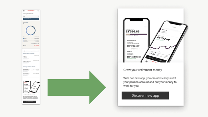
When our test user Emma logs in to mobile banking, she sees a teaser promoting the retirement app. Such teasers classically fall under the remit of Marketing, not UX Writing. To ensure we used the same wording throughout the entire experience, Marketing and UX Writing worked closely together.
Onboarding Screens
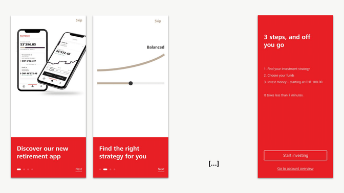
When Emma taps on the teaser, we reinforce Emma's interest in the retirement app with a so-called "nickel tour". Five onboarding screens present the app’s central features. The last screen is interesting for UX Writing because here we summarize in just a few words what Emma can expect.
[Title]
3 steps, and off you go
[List]
Find an investment strategy
Select a fund
Invest money
[Call to Action]
Invest now
User Flow Phase 2: Convert
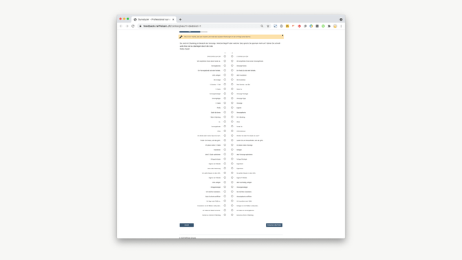
Emma decides that she wants to get started. We now guide her step by step from investment strategy to first investment. To do this, we need to find out which investment strategy suits her best. Is Emma prepared to take big risks or is she more concerned about security? We ask five questions to find out. We call this process "profiling" because we use it to generate a profile of Emma. Let’s take a closer look at two of these profiling screens.
Profiling Screen, Sample 1
Problem
User testing showed that the original text was poorly understood. Our test users had to read the questions several times before they could process and answer them.
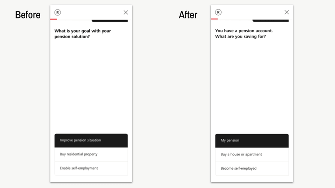
Solution
UX Writing simplifies terminology and text structure.
❌ 1 sentence with 8 words | ✅ 2 sentences, 5 + 5 words | ➡️ simplification
❌ complicated question | ✅ simple question | ➡️ simplification
❌ "pension solution" | ✅ "pension account" | ➡️ everyday language
❌ "residential property" | ✅ "house or apartment" | ➡️ everyday language
Impact
Qualitative testing revealed faster reading time and less confusion.
Profiling Screen, Sample 2
Problem
Our second sample shows the same problem: During user testing, users struggled to understand the question.
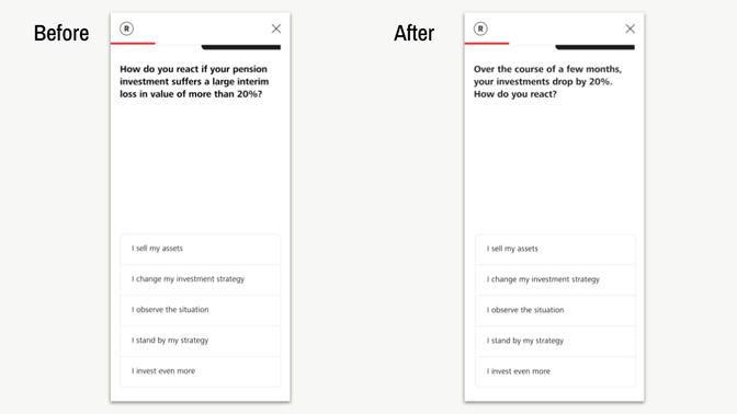
Solution
UX Writing simplifies terminology and text structure.
❌ 1 sentence with 19 words | ✅ 2 sentences, 10 + 4 words | ➡️ simplification
❌ complicated question | ✅ simple question | ➡️ simplification
❌ "your pension investment" | ✅ "your investment" | ➡️ concise wording
❌ "suffers a large loss" | ✅ "drop" | ➡️ simpler wording
In addition to the actual writing, we were able to introduce the first UX Writing pattern:
- Introduction
- Question
- Answers
This may seem trivial – after all, this pattern is obvious. Nevertheless, consciously writing down the pattern brought a lot of clarity to the whole UX team, because now we all agreed that whenever possible, we'd structure our screens according to the same pattern.
However, there was also a first setback. We needed to introduce an additional pattern for our call to action buttons. The goal here is simple: If users learn a text structure once, they can follow along with this learned structure. Having internalized this structure, they have more mental energy left to focus on understanding the content. But a button pattern had not yet emerged. For the first sample shown above, a verb-noun structure made sense. For the second sample, our test users responded quickest when we used a first-person “I” sentence structure for the buttons. We thus had to postpone the definition of the button patterns until the very end (see the Content Strategy chapter).
Impact
For various reasons, this project had to start without the UX Writing team on board. This late onboarding had the advantage of allowing us to show a clear before and after effect. After the screens with the revised text went through testing, it was clear to everyone: UX Writing makes an enormous difference to the user experience. The test users moved through the rewritten flow a lot faster and felt much more at ease.
Deep Dive: Our Work Process
Once the UX Writing team had become an integral part of the project, it was high time to set up a work process.
Problem
The UX team was already in place when the UX Writing team joined. That isn’t ideal. But experience shows that this is perfectly normal – things move so fast, especially in the beginning, that even more expertise and even more people would over-complicate what’s possible. So it's better to start with fewer people and grow with the requirements. That was also the case here. Once on board, it was important for us to be able to integrate UX Writing quickly. Therefore, we immediately defined a standardized process.
Solution
Together with the whole UX team, we defined the following workflow:
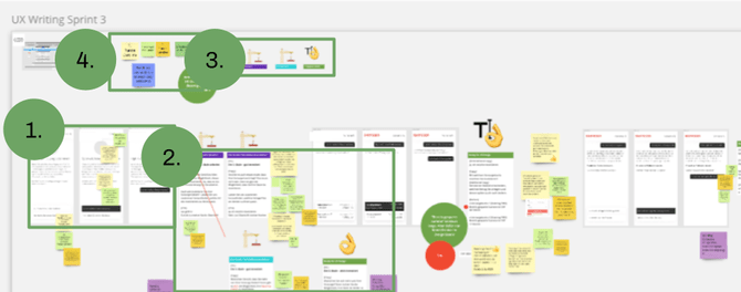
- Assignment of tools: The design team works in Figma. The UX Writing team works in Miro. This added work because we had to copy screens back and forth. But it helped keep the enormous complexity of versioning in check. Design variations were created in Figma. Text variations were created in Miro.
- Text versions: As in design, UX Writing rarely succeeds on the first try. It takes several versions to find the winner. Each white box in the image is a text version. The colored boxes above the text box indicate which concept the respective text version follows.
Examples of how to explain a UX Writing concept:
The “focus on the benefit” approach
The “focus on a community feeling” approach
The “short and direct” approach
The “young, fresh language”approach
These explanations help the team to distinguish between the different text versions and decide which version to choose. But this approach also helps our discipline: All stakeholders see that UX Writing is much more than just writing some text. UX Writers work strategically and according to a defined concept. This builds confidence in our discipline and the UX team soon realizes that they can leave the writing to the professionals.
- Color codes for different phases: As text went through different review stages, we assigned a color to each phase for simplicity.
Purple: UX Writing in progress
Blue: UX team giving feedback
Green: Ready for implementation
- Sticky notes for feedback: Each team member was assigned a sticky note color. This helped us to give each other feedback efficiently. The sticky notes were also useful when we questioned a decision in later sprints. We could always go back to the point of discussion and understand why we chose what.
Impact
Standardizing our work process from the beginning allowed us to efficiently jump onto the fast-moving project train. These clear structures also increased confidence in UX Writing. The team felt that UX Writers knew what they were doing. Trust is extremely important to UX Writing because, unlike design or development, everyone can write and everyone feels they can do UX Writing. But if the team sees that there are dedicated experts for the words and sentences and that they deliver real added value for the product, they will quickly stop writing themselves.
Deep Dive: Stakeholder Management
But back to our user flow. The profiling is complete and we know which investment strategy fits our test user Emma. However, before we suggest an investment product, we have to deal with every user's greatest fear: Legal screens. These are usually difficult to digest yet incredibly important, as they point out the biggest risks.
Problem
Our legal text was 10,000 characters long with a Flesch Reading Ease score of -9. We didn't even know that the Flesch score could be lower than zero. In other words, this text was written for academics and professionals. Our task was to apply human-centric language to all screens. However, the legal department is an important stakeholder at a bank, so getting straight to work and rewriting everything wouldn’t get us their okay. So how could we ensure readability in a way they would approve of?
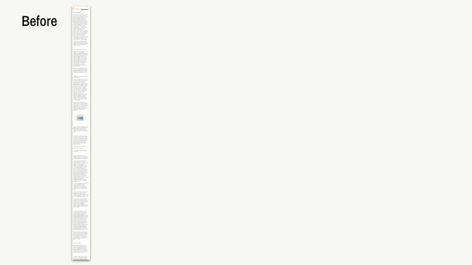
Solution
The first thing we did was to get back-up from high up. We organized a meeting with our Head of Customer Experience and got the order to apply human-centric language to the legal screens as well. Having C-level talk to C-level gave us the power to get started and we were ready to launch.
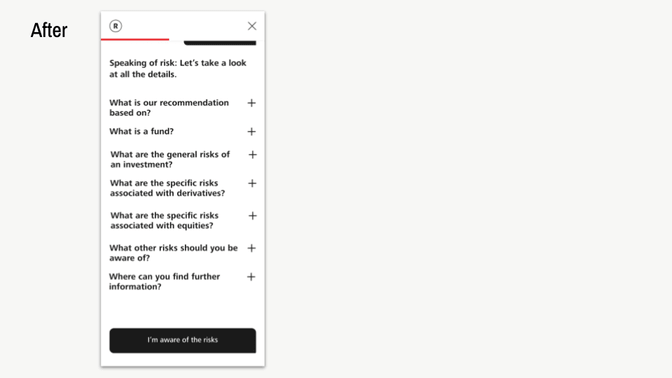
Step 1: We converted the content into a Q&A format. This allows Emma to scan through the questions and quickly and easily open the accordion where she wants more in-depth information.
Step 2: We developed questions that have relevance to Emma, so that she not only has to read the legal text, but actually wants to read it.
Step 3: We consistently used human-centric language.
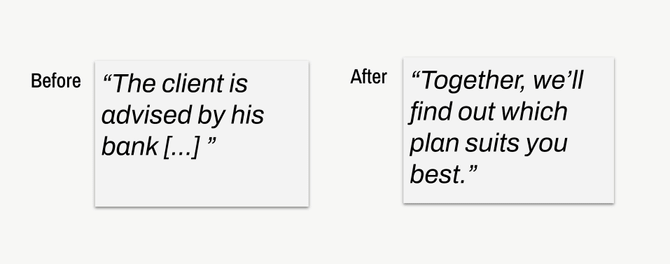
❌ customer | ✅ you | ➡️ direct address
❌ his | ✅ you | ➡️ inclusive language
❌ the bank | ✅ we | ➡️ personal self-reference
Impact
The Flesch Reading Ease score is now at 50, which indicates the reading level of a middle school student – still slightly challenging, but understandable for our target group. In addition, the Legal department got to know, trust, and appreciate the UX Writing team, which bolstered the foundation for future projects.
User Flow Phases 3 & 4: Onboard & Engage
Once Emma understands the risks of investing, an investment strategy is proposed to her. If she agrees with it, she can start investing right away. She selects her existing retirement account and decides how much money to transfer into her investment fund. As soon as Emma has transferred the money, she becomes an investor. In her mobile banking, she can now track the development of her investment and make changes at any time. And with this, Emma has reached the end of the user flow. For the UX Writing team, however, there was still work to be done. The Content Strategy developed during this project had to be prepared so that other teams could use it too.
Deep Dive: Content Strategy
While we were writing screens, the strategy gradually evolved as well. Let's now take a closer look at it.
Problem
It must be possible to scale the knowledge we develop within the UX Writing team – it’s pointless if we define a rule that only we know. Rules and conventions that emerge during the work have to be carefully documented and shared with everyone involved.
Solution
The first draft of the Content Strategy was created in a Google Doc. This provided a quick and simple solution that everybody could work with at any time.
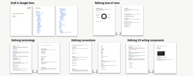
The Content Strategy includes the Tone of Voice and UX Writing-specific tone and voice examples. In addition, we defined wording. For example, the use of the key term "invest". But more on that in the next chapter. We also defined notations and conventions – for example, how we write dates or compound words in our screens. And of course, we had to define UX Writing components – info bubbles, error messages, or those call to action buttons mentioned at the beginning.
Impact
The app described here represents the first of many new apps and features the bank is planning to release. Thanks to our Content Strategy, new project teams have access to all the knowledge we developed. In the next phase, we’ll transform the Content Strategy into a nicely edited digital style guide so that everyone can access it even faster.
Deep Dive: User Testing
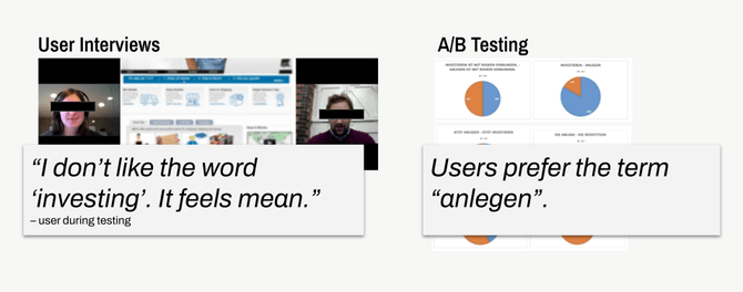
Testing is an integral part of any UX Writing project. We set up A/B testing from the very beginning to test terminology and to include it in our Content Strategy. Let’s consider the terms invest, which is the most important term in the app, and 3rd pillar, which is a term unique to the Swiss pension system.
The Term "invest"
In the German language – our core market – there are two terms for invest: investieren and anlegen. The first is precise technical language, the second is informal language. Which wording should we use in our app? The correct word in the context of a bank is investieren, but anlegen is more human-centric.
Problem
In user testing as well as in our A/B testing, it was shown that the term investieren is slightly negatively received. However, this is the most common and precise term in the banking world. On the other hand, we have the term anlegen, which is positively received but less precise. How should we deal with this dilemma?
Solution
We wanted to use both words, so we developed an educational flow in the Content Strategy. During onboarding, we use the informal term anlegen. During this getting-to-know-you phase, the human-centric language is particularly important. After profiling, when our user has become familiar with the topic and has become an early-stage expert, we switch to the technical term investieren.
Impact
The user testing showed that when we built our screens according to this educational flow, the term investieren no longer had a negative connotation. We had gradually turned Emma into an expert.
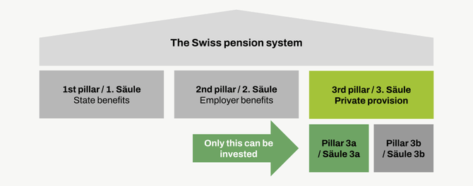
The term "3rd pillar"
The pension system in Switzerland is based on 3 pillars:
- The 1st pillar is the state pension.
- The 2nd pillar is the occupational pension.
- The 3rd pillar is the private pension provision.
The 3rd pillar is divided into pillar 3a and pillar 3b. Only pillar 3a can be invested.
Problem
Informally, the term 3rd pillar is commonly used. The difference between pillar 3a and pillar 3b is not relevant in everyday life and is rarely referred to. Since we are committed to human-centric language, we assumed that 3rd pillar would be better understood and accepted by users of our retirement app. We were so wrong, as will be shown!
Solution
A first look at Swiss search behavior indicated that we might be wrong with our assumption. The technical term pillar 3a is searched for more often than the informal term 3rd pillar.
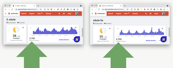
A/B testing also showed that our users are very familiar with the technical term and prefer it to everyday language. An unexpected result for all of us!
Testing clearly showed that users preferred the expert wording. And thus, we had to correct our assumptions and adjust the wording later on. It was a good reminder that we can't trust our assumptions. Lesson learned!
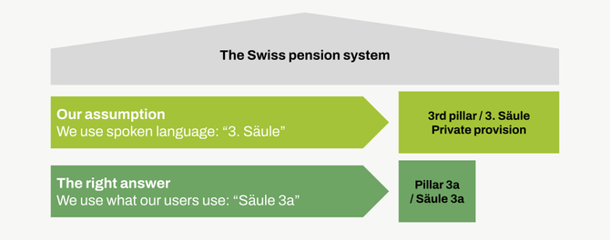
The realization that our users prefer the technical term has far-reaching consequences. Marketing, Sales, and Legal will also use this wording from now on. Step by step, word by word, we move a little closer to our goal of being a human-centric bank.
What we learned
We’ve taken you on a journey through a user flow and at the same time through our daily work as a UX Writing team. Along this path, we’ve learned things on three levels:
- The small things, the actual writing
- The big things, the strategic considerations
- Everything around our work process
We hope they’ll be of use in your process as well!
Huge thanks go to our team at Raiffeisen -- Laure Frank, Jana Nobel, Sonja Hamman, Stefan Sommer, Julien Adams, Patricia Brugger, Axel Schäfer, and Filipp Lebed, as well as my team at Liip -- Xenia Imbach, Jonathan Noack, Stephanie Grubenmann, and Denis Haraminčic, plus Jenny Zehnder, Katherine Nussey and Daniel Pieracci for helping me write this rather epic article.