
Yesterday I saw a video about a talk given by Johnny Chung Lee , a Human Computer Interaction researcher currently working at Google on the Project Tango platform, at Stanford HCI Seminar – «Interface Technologies That Have Not Yet Left the Lab». I was impressed about the amount of extraordinary ideas which still haven't reached the market. For many of them the time hasn't yet come. Though as Johnny Lee mentions, one of the reasons why they may fail is the lack of good Experience Design. Interfaces are there to capture the user need. Technologically driven people still tend to ignore the frustration felt by a user when he/she can't achieve his/her goal. The over-excitement about new technology blinds them and puts the user into second place. That's why one should always ask oneself – Why should a user use my product?
The Era of Specialization
During his talk, Johnny Lee was mentioning that we are facing a change of the technological paradigm. Firstly we had an «Era of Conversion» when we tried to combine multiple functions into one device, like for example our mobile phones. But now with the cost drop of multiple devices people can afford to buy the best product for each use case. Let's say people prefer to buy a GoPro camera than to film with their mobile phone, they prefer to read a book through Kindle than through a regular tablet and so on. We are entering into an «Era of Specialization». Products are there to serve only a few use cases, though these have to have a good hardware, software and User Experience Design, otherwise they won't succeed in the market.
The Foggy Cloud
The talk of Johnny Lee made me think about my personal experience with «new» technologies which lack a good User Experience and don't match society's current needs. Then I thought about the first time I came across iCloud. Although I consider myself almost a digital native, I never trusted this «cloudy» invention. Maybe because I still remember writing letters to my friends, which means I'm not that much of a digital native. Or could it be because I wasn't properly introduced to it? I felt like digging deeper into this subject and began to research about other users' opinions, until I realized that I wasn't the only one feeling lost when getting in touch with iCloud for the first time – there was for sure an overall User Experience problem.
If I remember well I suddenly was asked to register to this iCloud and to upload all my personal data to «Apple's Heaven». The «Apple Angels» would then synchronize all my Apple devices and I would never have to worry again. Of course I felt insecure and dissatisfied! What the hell? I want to be able to control what I want to synchronize and to backup. Like I did before with iTunes. But they didn't let me stay with the old way. There were always some warnings telling me to login to iCloud and that if I didn't do so something bad would happen. At least this was how I and several other users felt.
Here is one of many examples which prove the overall users dissatisfaction – « Why is iCloud Contact Sync such a terrible mess?» by Cfacc, Apple Communities. If you click on the link you will see the comment underneath about a user complaint. It perfectly illustrates how I felt the first time I had to deal with iCloud.
«I don't use iCloud and using it for contact and calendar sync is something I will not do. Mavericks has messed up my whole workflow and I'm extremely ** off and there is no way in **** I'm ever buying anything from apple again if this is the road they want to force us users down.
My iPhone is now a piece of worthless junk without calendar syncing. I want my money back… to buy hardware and software that works and doesn't blackmail me into your foggy cloud with an open backdoor to anyone who feels like they need to take a peek into other people's lives.
An extremely ** off user of your overpriced junk which is progressively degenerating with every update.»
I found this comment extremely useful for my further research and of course I couldn't help but laugh, even knowing how frustrating it was for me as well when I first got in touch with iCloud.
Moreover, analyzing this User Experience problem through Don Norman's, director of The Design Lab at University of California and co-founder of Nielsen Norman Group, Human Action Cycle, made me realize what went wrong. The interaction process missed the first three phases: «Goal Formation», «Intent to Act» and «Planning the Act». Instead the interaction starts immediately with the «Execution of the Act». Well, this only could go wrong, because the user has no control nor freedom.
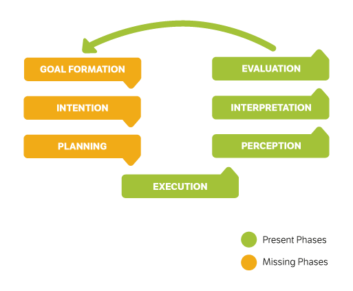
Human-machine interaction steps according to the Norman's theory.
Golden Rules for a Good User Experience Design
Besides not following the whole Human Action Cycle, it doesn't accomplish several golden rules for a good User Experience Design. Going back to Johnny Lee's talk – a product only succeeds if it has a good software, hardware and a good User Experience. In my opinion iCloud lacks the last one. At least seven of Jakob Nielsen's ,web usability consultant and co-founder of the usability consulting company Nielsen Norman Group, ten Usability Heuristics weren't followed.
Missing Usability Heuristics:
Usability Heuristic 1 – Visibility of system status
Users weren't being informed about what was going on, for example what, when and where something was being backed up or synchronized.
Usability Heuristic 2: Match between system and the real world There was never a clear and easy explanation about how Cloud Computing works. This may be obvious for a programmer, but for a non-specialist person it's something obscure and scary.
Usability Heuristic 3: User control and freedom This best practice was completely ignored because there was no introduction and users were more or less forced to use it. Besides that I never had the feeling I was in control, for example: I often felt like if I press «that» button there is no way back and that I could never get rid of the reminders and warnings about me not being a «well behaved» iCloud user.
Usability Heuristic 4: Consistency and standards The wording wasn't clear. For example I was never sure if «iCloud Drive» was the same as «iCloud» – the icon was the same but the name different. There are also different ways to access iCloud throughout the various devices and some visual inconsistency, which makes everything even more confusing.
Usability Heuristic 5 and 9: Error prevention and help users recognize, diagnose, and recover from errors Due to unclear wording and lack of explanations, accidents like the one described on the user's complaint above occurred. Personally, as I have no patience to get informed about something that I was obliged to use, I just never dared to truly use iCloud's full potential. I didn't want to risk losing data or have it stolen – there is indeed only one password which prevents a hacker from stealing all my information.
Usability Heuristic 7: Flexibility and efficiency of use Using iCloud requires reading many warnings and going through steps which are confusing. Like using email accounts which I never created: xxx@me.com, xxx@icloud.com or xxx@mac.com. Even my Facebook account and my Apple-ID are somehow involved, no clue how. Furthermore I never recall how I have to access iCloud: Is it through the website www.icloud.com? Or through my phone? But on my phone it's integrated under «utilities» and it has a different interface design, etc.
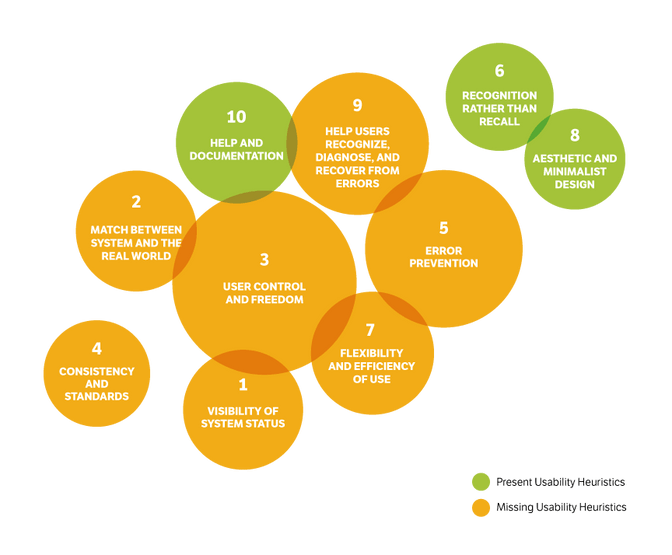
Graphical representation of the Usability Heuristics relevance and relation in iCloud.
The User Need First
The iCloud example is just one of many new technologies which do not achieve their full potential and popularity, because they aren't aligned with the user need and habits yet. The same happened for example with the Google Glass and the Apple Watch, which turned out to be just gadgets for a minority of technology enthusiasts. These kinds of business failures surely result from a partial or even total lack of user research. That's why Human Computer Interaction Design plays a crucial role in the process of creating a new product.
Apple should have made a much smoother introduction and transition to iCloud, e.g. through:
- Doing honest user research – more research about the user need before launch ;
- Launching one feature at a time and testing its acceptance – more user testing (before and after launching);
- Making sure that people understand what iCloud is, so that they can rely on this technology – more user support ;
- Giving users the option to decide whether they want to use iTunes, iCloud or a mix of both – more user control and freedom .
In my opinion, these are the four most relevant aspects which Apple failed to achieve.
In conclusion, users should always come before the aspect of technical innovation. There is no benefit for users if an innovative solution or product exceeds their needs. An innovation only gains real value if it is employed in a useful way. That's why there are in fact many «Interface Technologies That Have Not Yet Left the Lab». In fact, the majority of new consumer tech is «old tech» for which the time is NOW ripe.