

At Liip want to improve the relationship between designers and developers. There are already plenty of excellent platforms to share the work of the designers and plenty of ways to get the information needed to implement the designs. Cool and fancy tools, but extracting design decisions and making something coherent out of the designs is a repetitive task, and time-consuming for a frontender. What if these steps could be done in one click?
A shared vocabulary
Designers and developers have to speak the same language. Bringing a bit of frontend logic and naming conventions into a design tool helps the designer to understand the developer's point of view, and helps to deliver the design assets in a structured way.
Build bridges
Sketch is a design tool widely used by the designers at Liip.
Tailwind is a CSS framework widely used by the frontenders at Liip.
Why not make a bridge between these two complementary worlds? Say welcome to Sketchwind!
(Or Tailtch if you prefer)
What is Tailwind?
Tailwind is a CSS framework for rapidly building custom designs. This framework doesn't offer you predesigned elements like most of the classical CSS frameworks (Bootstrap, Foundation, etc). Tailwind proposes a way more atomic approach and unopinionated classes and naming system. This naming system and all its related values can be customised in a single file, the Tailwind configuration file. This file regroups all the font definitions, colours, spacings, shadows, border radiuses, breakpoints and more. Said differently, it contains all the designs decisions, taken at an atomic scale. We decided to generate this file, directly from Sketch, through a Sketch plugin.
Sketchwind, the template
Sketchwind is an open source Sketch template, based on Tailwind philosophy. It contains the basics stones for building a design system, coherently and comprehensively: font definitions, colours, spacings, shadows, border radiuses, breakpoints and more...
Most of the elementary bricks of the design system are isolated and regrouped, and can be combined following the designer's needs.
The default values defined in the template are based on the default values of Tailwind. You can modify them or determine new ones, and export them as a Tailwind config at any time during your design process. Make an export when a new design decision has been made in your system, and it will be reflected in Tailwind. An in-context detailed documentation will help you to step-in and bootstrap your future design system.
Download Sketchwind template and
Download Sketchwind exporter
Wireframes vs final designs: use the same assets
As Tailwind does, Sketchwind doesn't deliver predesigned assets or designs like buttons or input fields. For example, default styles are in black and white, but a complete colour system is available, easily adaptable, and ready to be exported.
In that direction, the template proposes «undesigned» smart symbols. You will be able to override and customise these symbols, as you wish and when you want. You could consider these global symbols like stem cells. They are not defined yet, but they can become anything, at any time.
That means you could start your designs and deliver wireframes first, and then reuse the same components and deliver the final designs. All design modifications done in your «stem cells» will be spread in your designs and components.
Best practices and accessibility
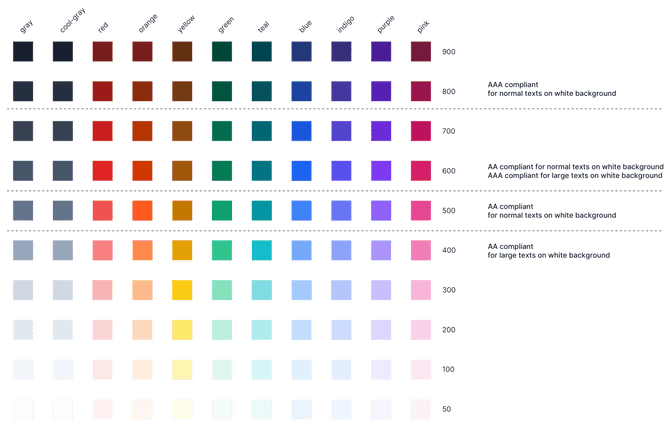
The Sketchwind template contains a few components based on Sketch best practices, and invite the designer to think about accessibility at the very beginning of the project. The predefined colour palette has some basic hints regarding color contrasts, and a part of the global symbols are ready to use for designing the focused elements.
Additional assets
This colour palette comes from Tailwind UI, a component library based on Tailwind CSS. The library includes a complete open source icon family called heroicons. We integrated it in Sketchwind.
Every icon has a symbol, where you can override the colour, the type (filled or outlined) or the stroke width.
Of course, you are free to import your icons and assets, but having a perfectly executed icon library out of the box is very convenient for bootstrapping a project and build advanced prototypes quickly.
Naming conventions
The structured elements of the template and how the design assets are grouped and isolated helps the understanding of a frontender job. Additionally, the proposed naming convention for the components brings the default vocabulary of Tailwind in a Sketch template. As Tailwind does, this vocabulary is flexible and customisable. Designers and developers can adapt it to their needs and their common vision.
Sketchwind exporter, the plugin
If the frontend implementation of your project will be done with Tailwind CSS framework, you can use the Sketchwind exporter. This plugin parses the Sketch template and extracts the following design assets:
- Colours
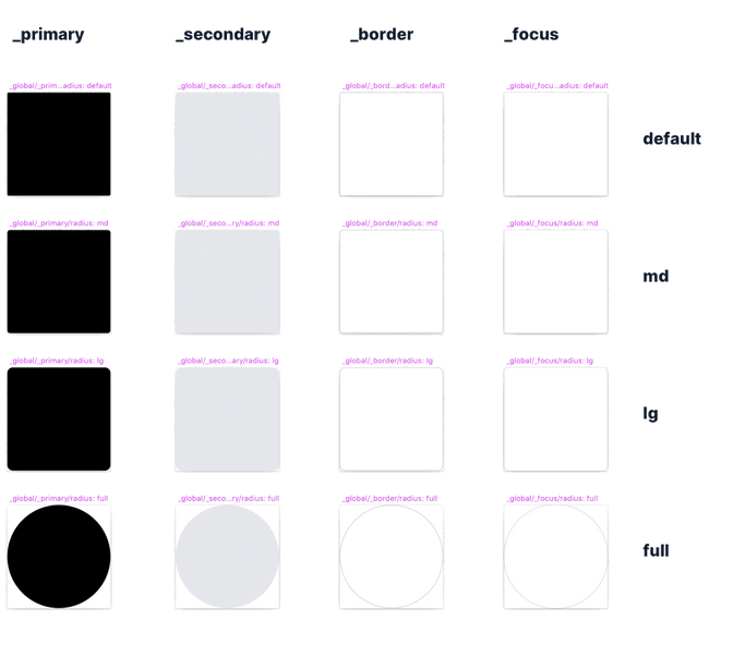
- Border radiuses
- Border widths
- Box shadows
- Opacities
- Spacings
- Breakpoints
- Font Families
- Font sizes and line heights
- strokes for svg icons
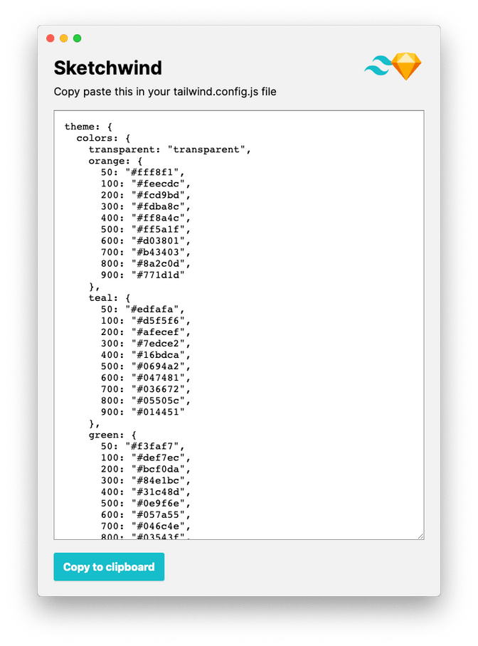
A JSON file is generated, and you just need to copy-paste it in the 'tailwind.config.js' file of your project. Done!
Download Sketchwind template and
Download Sketchwind exporter
Sketch API
This plugin was a pleasure to develop with the help of the simple Sketch API. Written in JavaScript and based on a modern stack, every frontender can settle quickly in a Sketch plugin development. Thanks to this API, devs and designers can improve their own tools together and improve their collaboration.
Final words
Not only clients need the help of developers, internal employees have specific needs too. At Liip, we are continually thinking about how to improve our processes and methods. And sometimes we build our own tools to fulfil missing bricks of a proficient workflow. Shaping a tool for Liip designers and developers, sharing the work with the community is a rewarding experience we want to continue. Try out Sketchwind and Sketchwind exporter, and tell us how it influences your workflow and the collaboration between developers and designers. And contribute to the project on Github!
Downloads
- Download Sketchwind template or get it on on Github
- Download Sketchwind exporter or get it on Github
Plugin development
- Discover Sketch API: https://developer.sketch.com/reference/api/
- Utility for plugin development: https://github.com/skpm/skpm
- Debugging with Sketch dev tools: https://github.com/skpm/sketch-dev-tools
Frameworks and icons
- Tailwind CSS: https://tailwindcss.com/
- Tailwind UI: https://tailwindui.com/
- Heroicons: https://heroicons.dev/