

Over the last few years I had to optimize images with srcset on different websites, several times.
After each optimization I thought that I understood how the srcset and sizes attributes of the <img> tag works. But each time, I made some new findings about how these attributes really work and where I need to take care while implementing them. Since there are lots of things you should know before using srcset I thought it could be useful to summarize the most tricky parts in a blog post.
A short introduction
I think most of you already heard of responsive images and especially the srcset attribute. But to be on the same page I still would like to start with a short introduction about these two attributes:
srcset
The srcset attribute is listing different resolutions of the same image from which the browser chooses the best fitting image source before loading it.
Example: srcset="ninja-1000w.jpg 1000w, ninja-500w.jpg 500w, ..."
To calculate this, the browser assumes the image fills up the full viewport width (100vw) by default, which means it uses the full width of the browser.
sizes
To tell the browser how much space the image really needs on our viewport, we can use the sizes attribute. This attribute contains a comma separated list of one or more image widths for different viewport sizes.
Each entry is a combination of a media condition and a width. Both of these values are described in CSS pixels so we don't need to care about device pixel ratio for this. If the media condition is omitted it evaluates to true automatically (= fallback). The sizes attribute gets read from left to right. As soon as a media condition evaluates to true the width of this entry is used. So be sure to order your values correctly!
Example: sizes="(min-width: 1000px) 50vw, 100vw"
The example above tells the browser that if the viewport is at least 1000px wide the image fills 50% of the space. If the browser is smaller, the image uses 100% of the available width.
If we combine the above two examples in an <img> tag and request it with a (1x/non-retina) browser the result would be the following:
- Browser width:
500px-> Matching sizes width:100vw-> Needed image size:500w-> Chosen image:ninja-500w.jpg. - Browser width:
900px-> Matching sizes width:100vw-> Needed image size:900w-> Chosen image:ninja-1000w.jpg. - Browser width:
1000px-> Matching sizes width:50vw-> Needed image size:500w-> Chosen image:ninja-500w.jpg.
Sizes affect how the image is shown
The first thing which is important to know about the sizes attribute is that it isn't only used to calculate the needed size, it is used as the rendered width of the image if the width is not defined in CSS too.
This means as soon as you add the srcset attribute to the <img> element the image might be displayed differently.
The reason for that is when you add the srcset attribute and omit the sizes attribute, the browser uses the default value for it, which is 100vw.
Here's an example (https://codepen.io/tschortsch/pen/LeMmyO):
As you can see, the browser stretches the image always to the matching size in the sizes attribute, as long as the width is not defined in CSS.
This leads us to Rule #1: Always set the sizes attribute if you use srcset. If sizes is omitted it defaults to 100vw.
How the browser selects the needed image size
Short answer: We can't tell.
Long answer: Every browser has a slightly different implementation which can change with every version of the browser. This leads to Rule #2: Never assume which image size the browser will choose.
The browser just chooses the best matching image for the current size. But if the browser finds a cached version of an image from the current srcset which is bigger than the needed size it prioritizes the image from the cache for example.
This makes it really hard to debug a srcset. To avoid the loading of cached files you should always debug srcsets in your browsers privacy mode.
As a result of this, it is possible that you have two exact same devices (same screen and browser size) but you get a different image size in both browsers.
Another really important takeaway from this brings us to Rule #3: A srcset should only contain images of the same ratio.
Since you can't really decide which image is loaded in which browser size you can't use srcset to serve different images on different sizes a.k.a. art direction (eg. 1:1 image on smaller devices, 2:1 image on larger devices). If you would like to do this you should use the <picture> element.
Pitfalls of the width ('w') descriptor
The width (w) descriptor of the srcset attribute has also some things which should be taken care of. First of all Rule #4: The width (w) descriptor should always match the images natural width. This means if the image has a width of 500px the width (w) descriptor should be exactly 500w. This sounds pretty easy to achieve but there are use cases where this isn't as easy.
Think of the following example: You load your images through a CDN, where you predefine all the sizes that should exist of an uploaded image. In the template you define a srcset with all of those predefined sizes. If you do not enable upscaling (on CDN side) and upload an image which is smaller than the biggest defined size, you will get an image which doesn't fit the width (w) descriptor in your template.
If this is the case you can get unexpected results. Let's look at this example (https://codepen.io/tschortsch/pen/rpoXvW / The problem in the example only occurs with screens that have a DPR >= 2):
If you don't have a display that has a DPR >= 2 here's a screenshot of what would happen if you had:
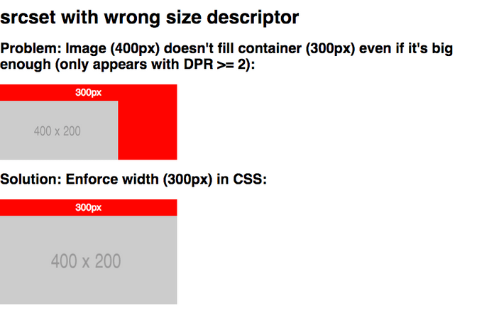
What is showed in the example above? As long as we don't define a CSS width, the image (which is originally 400px wide) doesn't fill up a container which is only 300px wide.
Let me explain what's happening here: We have an image container which is 300px wide. The image has a srcset with two possible image sizes: 300w, 600w. The 300w image has a natural width of 300px (correct). But since the original image has a width of 400px the 600w doesn't return an image which is 600px wide but the original 400px image (wrong).
If this container gets loaded with a DPR >= 2 the browser requests the 600w image (2 * 300px). Since the browser doesn't know that the image behind this descriptor is smaller than 600px it displays it as it would be that size. This means it gets squeezed to half of its size (400px / 2 = 200px). And that's why we end up with this strange situation that the image (which is originally 400px wide) doesn't fill the whole 300px image container.
When we enforce the image width in CSS, like we do in the 2nd example, the (400px) image gets stretched again to fill the 300px container and everything looks like expected.
And here we are with the Rule #5: Always enforce the image size in CSS when using srcset.
Wrap up
As you see responsive images have some parts, you should know when implementing them. Let's quickly go through our rules again:
- Rule #1: Always set the
sizesattribute if you usesrcset. Ifsizesis omitted it defaults to100vw. Since thesizesattribute has an influence on how the image is displayed, it should never be omitted. If you do so, the browser uses the default value of100vw. - Rule #2: Never assume which image size the browser will choose. The reason for this is, that all browsers have slightly different implementation on how the correct image from a
srcsetis chosen. This implementation should be a black box for us, because it can change with every update. - Rule #3: A
srcsetshould only contain images of the same ratio. As a result of rule #2 we never know which image is loaded by the browser. To get the same result for all visitors every image in thesrcsetneeds the same ratio. - Rule #4: The width (
w) descriptor should always match the images real width. The browser uses the width (w) descriptor to calculate how it should display the image. If it doesn't match the real width, we can get unexpected behaviour. - Rule #5: Always enforce the image size in CSS when using
srcset. Since there are some use cases where rule #4 can't be achieved, we should always enforce the width of an image in CSS.
Further resources
There are some really good resources to learn more about responsive images:
- Responsive images on Mozilla Developer Network: https://developer.mozilla.org/en-US/docs/Learn/HTML/Multimedia_and_embedding/Responsive_images
- Responsive images on CSS-Tricks: https://css-tricks.com/responsive-images-youre-just-changing-resolutions-use-srcset/
- Very nicely done introduction about
srcsetandsizes: http://ericportis.com/posts/2014/srcset-sizes/ <img>Element documentation: https://developer.mozilla.org/en-US/docs/Web/HTML/Element/img