

The new WordPress editor (Gutenberg) comes with lots of pre built blocks (Paragraph, List, Image, etc.). Each block has its own markup which wraps the content of it. This markup is generally generic enough that it works with most of the themes. But there are cases where you would like to change the appearance of these blocks in some way.
Let's say we would like to add a spacing control to the existing image block (core/image) where we can choose between a small, medium or large margin which should be added below the image.
1. Add spacing attribute
Before we can add a custom control to the image block we need a place where we can save the chosen value. In Gutenberg this is done with block attributes.
To add a custom attribute to an existing block we can use the blocks.registerBlockType filter like this:
import assign from 'lodash.assign';
const { addFilter } = wp.hooks;
const { __ } = wp.i18n;

// Enable spacing control on the following blocks
const enableSpacingControlOnBlocks = [
    'core/image',
];

// Available spacing control options
const spacingControlOptions = [
    {
        label: __( 'None' ),
        value: '',
    },
    {
        label: __( 'Small' ),
        value: 'small',
    },
    {
        label: __( 'Medium' ),
        value: 'medium',
    },
    {
        label: __( 'Large' ),
        value: 'large',
    },
];

/**
 * Add spacing control attribute to block.
 *
 * @param {object} settings Current block settings.
 * @param {string} name Name of block.
 *
 * @returns {object} Modified block settings.
 */
const addSpacingControlAttribute = ( settings, name ) => {
    // Do nothing if it's another block than our defined ones.
    if ( ! enableSpacingControlOnBlocks.includes( name ) ) {
        return settings;
    }

    // Use Lodash's assign to gracefully handle if attributes are undefined
    settings.attributes = assign( settings.attributes, {
        spacing: {
            type: 'string',
            default: spacingControlOptions[ 0 ].value,
        },
    } );

    return settings;
};

addFilter( 'blocks.registerBlockType', 'extend-block-example/attribute/spacing', addSpacingControlAttribute );
Let me explain this code step by step:
First we need to define some variables which are used at multiple places in our example.
// Enable spacing control on the following blocks
const enableSpacingControlOnBlocks = [
    'core/image',
];
In the enableSpacingControlOnBlocks array we can list all existing blocks where the spacing control should be available. In our example we just add the core/image block.
// Available spacing control options
const spacingControlOptions = [
    {
        label: __( 'None' ),
        value: '',
    },
    {
        label: __( 'Small' ),
        value: 'small',
    },
    {
        label: __( 'Medium' ),
        value: 'medium',
    },
    {
        label: __( 'Large' ),
        value: 'large',
    },
];
The spacingControlOptions array lists all available options which can be chosen in our spacing control element.
const addSpacingControlAttribute = ( settings, name ) => {
    // Do nothing if it's another block than our defined ones.
    if ( ! enableSpacingControlOnBlocks.includes( name ) ) {
        return settings;
    }

    // Use Lodash's assign to gracefully handle if attributes are undefined
    settings.attributes = assign( settings.attributes, {
        spacing: {
            type: 'string',
            default: spacingControlOptions[ 0 ].value,
        },
    } );

    return settings;
};
This is our callback function where the custom attribute gets registered. We first check if the block is one of our defined blocks in the enableSpacingControlOnBlocks array. If that's the case we add our new attribute spacing to the already existing blocks attributes.
addFilter( 'blocks.registerBlockType', 'extend-block-example/attribute/spacing', addSpacingControlAttribute );Last but not least we need to add this function to the blocks.registerBlockType filter.
The core/image block now has a new attribute spacing which we can use to save our chosen value.
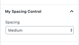
2. Add spacing control
As a next step we need to create the spacing control element to the blocks InspectorControl.
The result should look like this:
Gutenberg provides the editor.BlockEdit hook to extend the blocks edit component (which includes the InspectorControl part).
const { createHigherOrderComponent } = wp.compose;
const { Fragment } = wp.element;
const { InspectorControls } = wp.editor;
const { PanelBody, SelectControl } = wp.components;

/**
 * Create HOC to add spacing control to inspector controls of block.
 */
const withSpacingControl = createHigherOrderComponent( ( BlockEdit ) => {
    return ( props ) => {
        // Do nothing if it's another block than our defined ones.
        if ( ! enableSpacingControlOnBlocks.includes( props.name ) ) {
            return (
                <BlockEdit { ...props } />
            );
        }

        const { spacing } = props.attributes;

        // add has-spacing-xy class to block
        if ( spacing ) {
            props.attributes.className = `has-spacing-${ spacing }`;
        }

        return (
            <Fragment>
                <BlockEdit { ...props } />
                <InspectorControls>
                    <PanelBody
                        title={ __( 'My Spacing Control' ) }
                        initialOpen={ true }
                    >
                        <SelectControl
                            label={ __( 'Spacing' ) }
                            value={ spacing }
                            options={ spacingControlOptions }
                            onChange={ ( selectedSpacingOption ) => {
                                props.setAttributes( {
                                    spacing: selectedSpacingOption,
                                } );
                            } }
                        />
                    </PanelBody>
                </InspectorControls>
            </Fragment>
        );
    };
}, 'withSpacingControl' );

addFilter( 'editor.BlockEdit', 'extend-block-example/with-spacing-control', withSpacingControl );
We first create a Higher Order Component (HOC) withSpacingControl. It receives the original block BlockEdit component which we can extend.
if ( ! enableSpacingControlOnBlocks.includes( props.name ) ) {
    return (
        <BlockEdit { ...props } />
    );
}
We again check if the block is one of our defined blocks in the enableSpacingControlOnBlocks array. If this isn't the case we return the original BlockEdit component.
const { spacing } = props.attributes;

// add has-spacing-xy class to block
if ( spacing ) {
    props.attributes.className = `has-spacing-${ spacing }`;
}

return (
    <Fragment>
        <BlockEdit { ...props } />
        <InspectorControls>
            <PanelBody
                title={ __( 'My Spacing Control' ) }
                initialOpen={ true }
            >
                <SelectControl
                    label={ __( 'Spacing' ) }
                    value={ spacing }
                    options={ spacingControlOptions }
                    onChange={ ( selectedSpacingOption ) => {
                        props.setAttributes( {
                            spacing: selectedSpacingOption,
                        } );
                    } }
                />
            </PanelBody>
        </InspectorControls>
    </Fragment>
);
Otherwise we wrap the original BlockEdit component in a Fragment and add a SelectControl inside the InspectorControls of the block where the spacing can be chosen. Additionally we add a specific has-spacing-xy class to the original component to be able to style the block in the editor if needed.
addFilter( 'editor.BlockEdit', 'extend-block-example/with-spacing-control', withSpacingControl );To make it work we add our withSpacingControl component to the editor.BlockEdit filter.
The spacing control should now be visible in the WordPress editor as soon as you add an image block.
3. Add margin to the saved markup
We can already select a spacing value in the backend but the change is not yet visible in the frontend. We need to use our spacing attribute to render a specific margin below the image block. We can use the blocks.getSaveContent.extraProps filter to do exactly that. With this filter we can modify the properties of the blocks save element. What we will do is map our chosen spacing to a pixel value which we add as margin-bottom to the image block.
/**
 * Add margin style attribute to save element of block.
 *
 * @param {object} saveElementProps Props of save element.
 * @param {Object} blockType Block type information.
 * @param {Object} attributes Attributes of block.
 *
 * @returns {object} Modified props of save element.
 */
const addSpacingExtraProps = ( saveElementProps, blockType, attributes ) => {
    // Do nothing if it's another block than our defined ones.
    if ( ! enableSpacingControlOnBlocks.includes( blockType.name ) ) {
        return saveElementProps;
    }

    const margins = {
        small: '5px',
        medium: '15px',
        large: '30px',
    };

    if ( attributes.spacing in margins ) {
        // Use Lodash's assign to gracefully handle if attributes are undefined
        assign( saveElementProps, { style: { 'margin-bottom': margins[ attributes.spacing ] } } );
    }

    return saveElementProps;
};

addFilter( 'blocks.getSaveContent.extraProps', 'extend-block-example/get-save-content/extra-props', addSpacingExtraProps );
In the addSpacingExtraProps function we create a little mapping object where which we can use to map our selected spacing value (small, medium or large) to an appropriate pixel value.
Afterwards we add this value as margin-bottom to the style attribute of the block.
That's already it! Our selected spacing value gets mapped to an appropriate margin-bottom value and is added to the saved markup of the block.
Wrap up
It's not that hard to extend an existing Gutenberg block. So before creating a new block think about if it would make more sense to extend an existing block to your own needs.
This tutorial is also available as a WordPress plugin on GitHub: https://github.com/liip/extend-block-example-wp-plugin. Feel free to use it as a starting point to extend Gutenberg blocks in your WordPress site.